SPLIT
Branding and web design for a SaaS startup.
Split is a software startup offering a feature delivery platform that enables engineering teams to deploy code faster through controlled releases and feature flagging—accelerating iteration without compromising stability.
Role: Creative Direction and Design
Activities: branding, graphic design, iconography, information architecture, UI, UX
On the web:

PROJECT DETAILS
Split’s founders engaged us to refine their brand ahead of Series A funding and key hires.
BRAND DEVELOPMENT
Co-founder Trevor Stuart approached Working Concept to establish a confident, enterprise-ready brand. At the time, Split had just secured seed funding and was operating a private beta with a placeholder site. The goal was to quickly elevate their brand and web presence to attract investors, talent, and early users.
GOALS
Design a logo to lead Split’s brand evolution, extending across the product and corporate website
Balance an enterprise-grade feel with a touch of playfulness
Create a cohesive visual language to apply across iconography, illustrations, and product animations, that aligns with the brand tone
Clearly communicate Split’s value proposition to resonate with key buyers and decision-makers
THE LOGO
Using the team’s goals and existing color palette, we refined the logo to help define Split’s visual style.
Split's product is geared towards engineering and development processes and we wanted to pull that into the core brand identity. Brackets naturally lent themselves to creating an abstract 'S' shape and were aligned with the product and brand goals.
The final logo was built for flexibility, working across app icons, swag, and event branding.
Angled bracket sketches
Logo refinements
Many of these iterations have had some time to shine through Split's continued brand evolution.
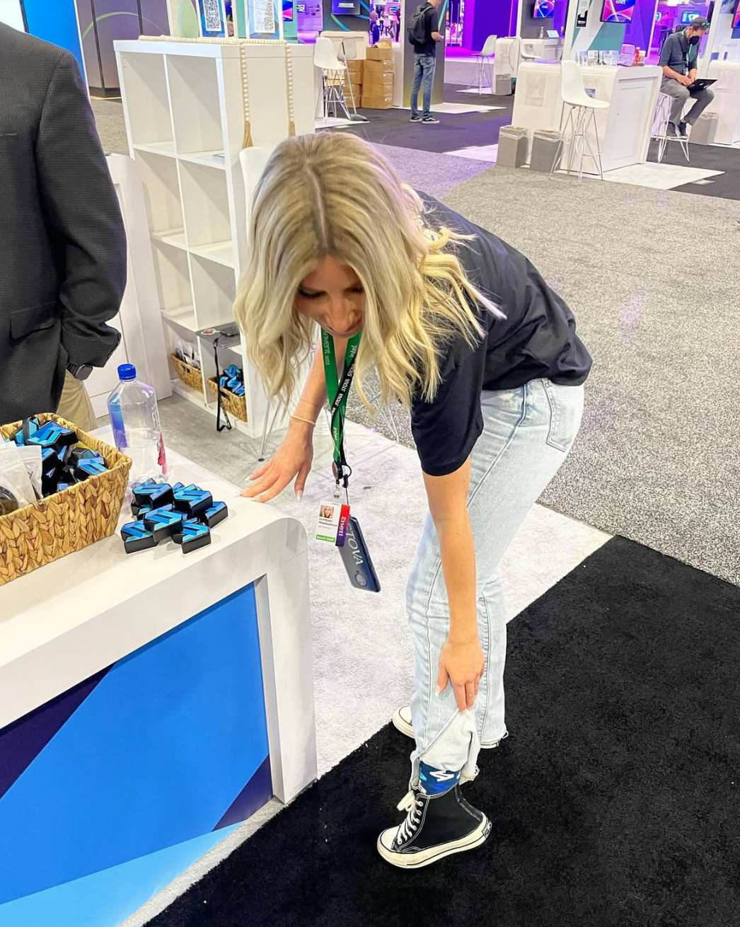
Refreshed colors on a new office sign.
ICONS
Split wanted to balance trustworthiness with an energetic, approachable feel.
We developed bold, playful icons and illustrations, starting with sketches of values, benefits, and features. These concepts were refined into high-fidelity icons for testing and final use.
Concept sketches
Refinements
The completed set of icons is impactful, clean, and playful, utilizing color tones to remain adaptable and engaging.
Culture and product icons from the set.
FIRST WEBSITE
The leadership team needed to present complex technical information clearly to support Split’s move out of private beta.
We created a simple site plan from their documentation, identifying where videos and screenshots would help. Collaborating closely, we developed wireframes and high-fidelity designs for review before launch.

Site planning

Wireframes
Values

Product page

Customer targeting animation
Split editor animation
Integrations animation
RESULTS
The website established Split’s market position, building credibility that helped gain customers, grow the team, and secure funding.
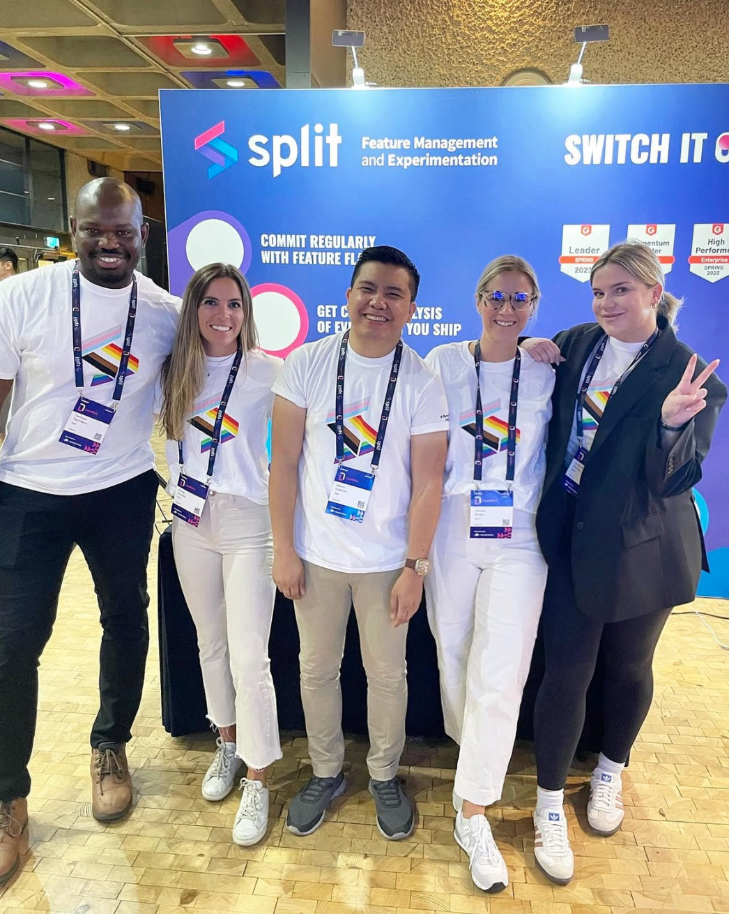
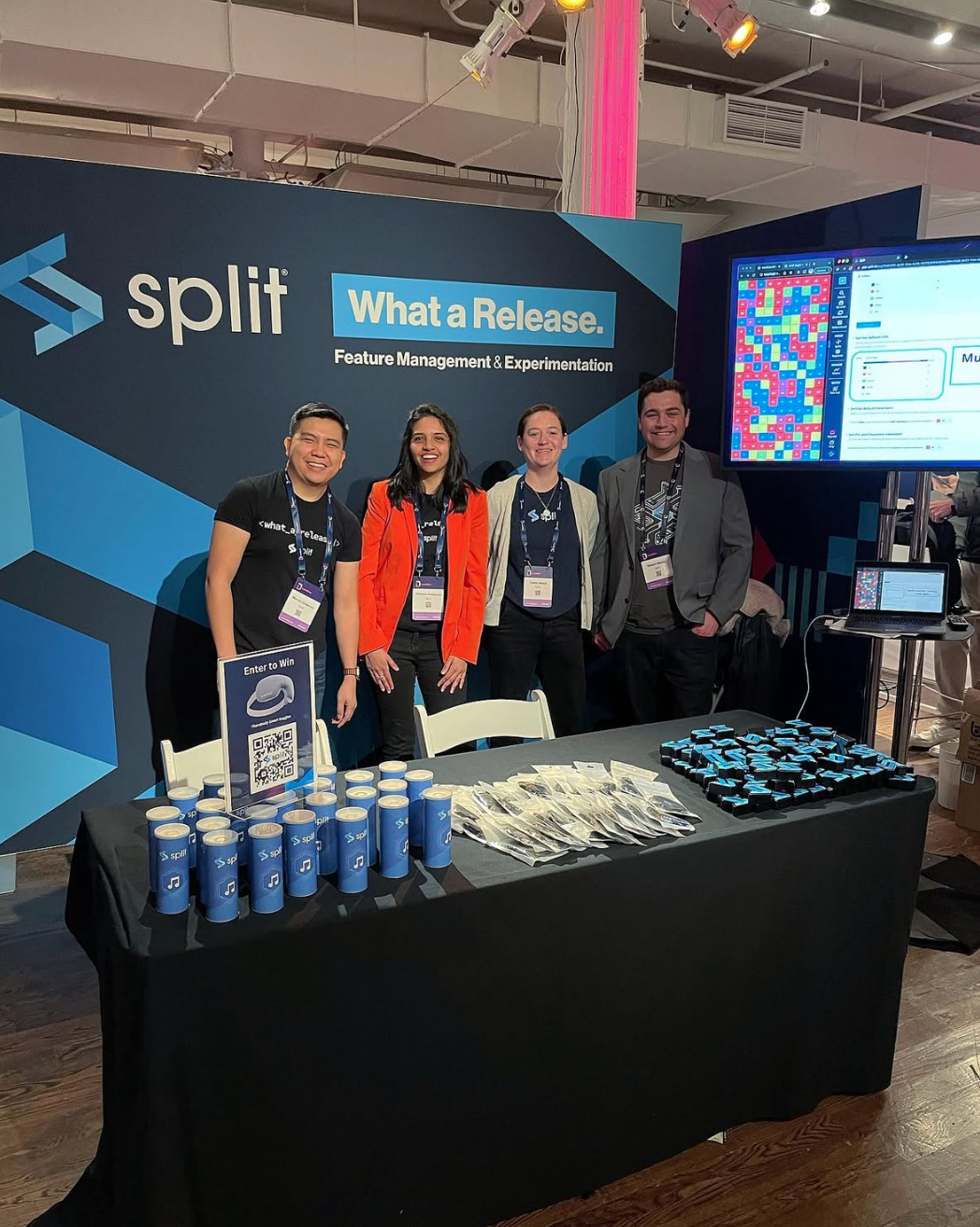
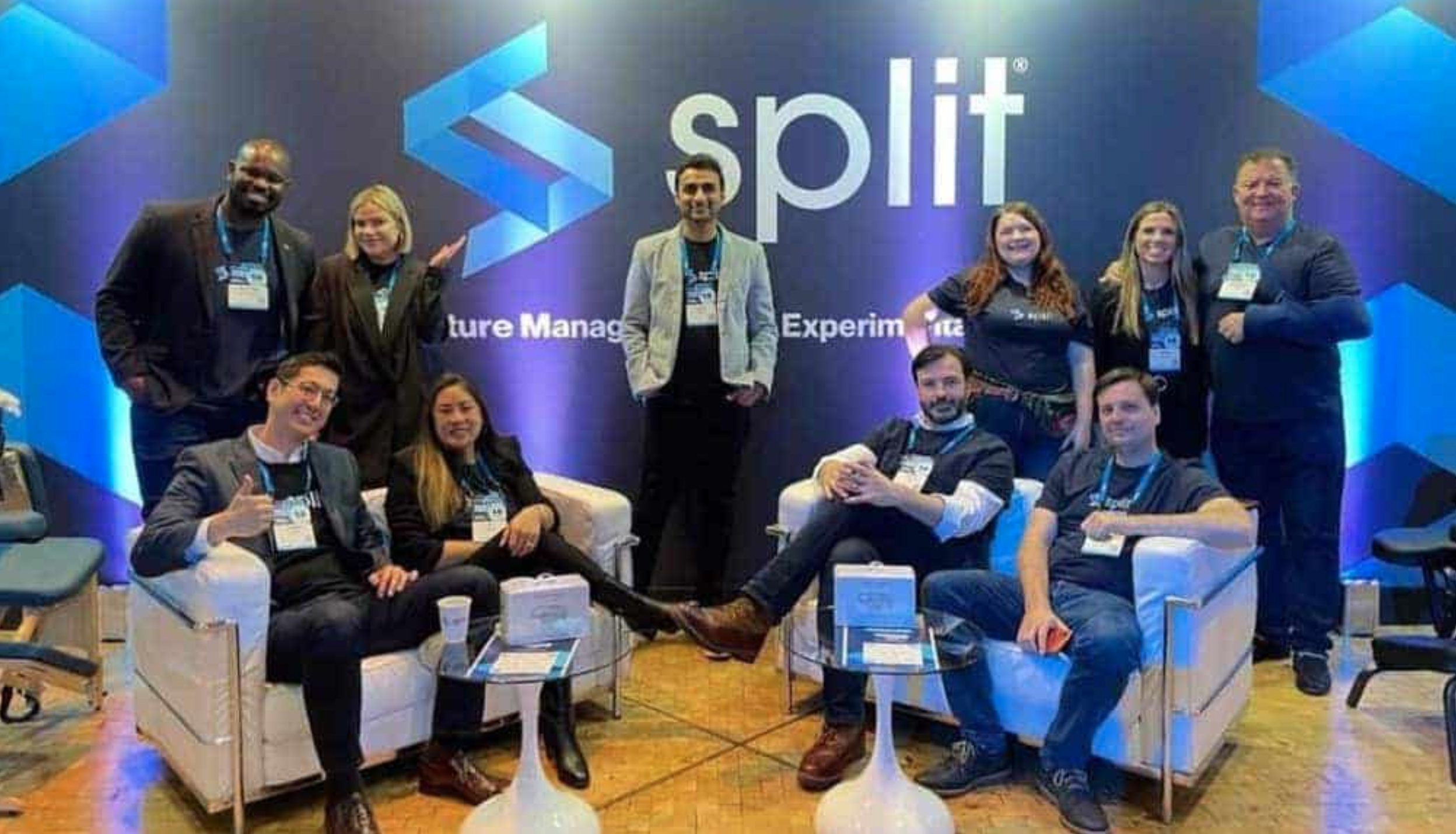
The logo evolved alongside the brand, adapting with new colors, gradients, and outline variations used across the product, events, and marketing.
Our collaboration delivered a flexible brand foundation that supported Split from their Series A funding through Series D, culminating in their acquisition by Harness in 2024.
The initial design continues to grow and evolve with the brand.


