SHAREBUILDER
Design of an award-winning mobile investing app for Capital One, ShareBuilder.
ShareBuilder offered low-cost trades and self-directed investing, growing to hundreds of thousands of users before its acquisition by Capital One. We rebranded the platform to align with Capital One, enhanced usability, and added key features to remain competitive in the online brokerage space.
Role: Creative Director
Activities: Creative direction, user research, competitive analysis, strategy, user flow and user experience optimization, design system, mobile product UI/UX design, usability testing, and quality assurance.
Awards: Gold Stevie in Business/Government for Financial Services, Bronze Stevie in Utilities & Services for Financial Services


PROJECT DETAILS
Redesigning the mobile investment experience and launching a new trading app.
GOALS
Reduce Call Center Volume
Audit and categorize frequent support issues to identify key problem areas.
KPI: Decrease call volume from mobile self-service trading errors by 20%.Improve Product Usability
Evaluate existing mobile investment tools to uncover opportunities for design and usability enhancements.
KPI: Retain current users and attract new account openings.Establish a Design System
Create a scalable design system with OS-specific UI components and interaction patterns.Brand Alignment
Extend Capital One’s brand to the ShareBuilder platform, ensuring consistency with existing Capital One mobile products where appropriate.
USER RESEARCH
Design and usability priorities were informed by user testing, customer feedback, focus groups, and call center support logs.
Key opportunities emerged where users faced friction, most critically during account creation, trade execution, and portfolio viewing. Secondary issues included gated content and password access problems, followed by frequent pain points in high-traffic areas of the app.
CHALLENGES
Overwhelming account views, slow to find and act on info
Mobile app copied desktop design, not optimized for small screens
Hit area conflicts causing frequent selection and navigation errors
High cognitive load; users unsure of next steps
Positions lack movement indicators, require extra taps (competitors offer this at a glance)
Duplicate labels in header and menu causing confusion
DESIGN SOLUTIONS
We reorganized menus and minimized unnecessary chrome by focusing on contextual interface elements. Quick switching between accounts was achieved through a top-level account switch. The reordered information cascade created a more intuitive flow, reducing the number of choices and taps required for an investor to view their account details.
CHALLENGES
Landing screen felt unprofessional and frustrating
No indication of which carousel items were accessible without signing in
Investors had to select a tile before accessing useful information, such as whether the markets were open or closed
Bugs sometimes blocked tile selection if carousel didn’t rotate
Carousel duplicated bottom navigation
Carousel felt too playful and outdated for a financial app
DESIGN SOLUTIONS
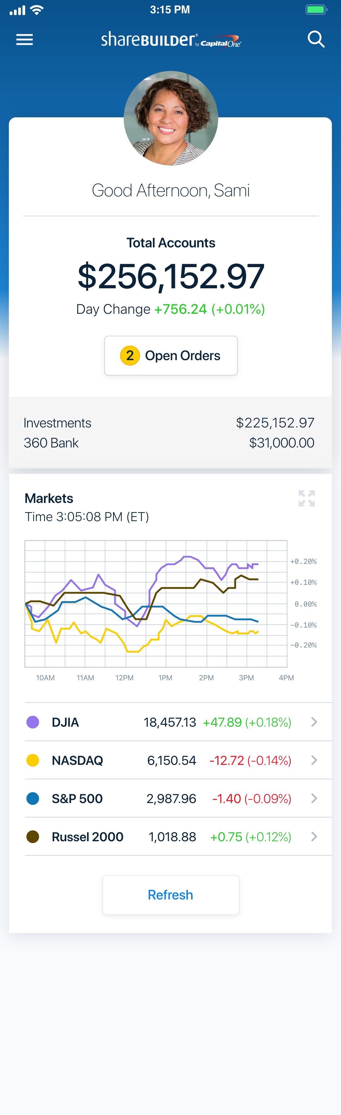
We created an active, customizable landing screen showing market data and messaging without sign-in. The unauthenticated home also displayed watch lists and news, letting users research before creating an account.
The authenticated home screen offered a clear overview of accounts, top holdings, and market data. Each snippet linked to its section, making navigation intuitive and faster.
DESIGN AUDIT
We reviewed the ShareBuilder mobile investment products from a design perspective, complementing user feedback. The audit identified risks related to navigation patterns and device conflicts—such as app switching, launch behavior, hardware and software keys, and mobile web browser chrome. These insights guided prioritized user experience improvements.
CHALLENGES
User experience is cluttered and confusing, with poor labeling and navigation
Layout risks navigation errors, causing accidental exits before trade completion
Excessive and inconsistent labels—some actionable, others static
Buttons remain active even when required fields are incomplete, leading to errors
Error messages are generic, lacking field-specific guidance and context
DESIGN SOLUTIONS
We redesigned the trade experience using updated requirements and mapped a new user flow to wireframes. Contextual features, such as a share calculator, were added to enhance the experience.
Logic was implemented to disable buttons until all required information was entered, reducing errors. Navigation was simplified to essential functions, improving user focus.
COMPETITIVE ANALYSIS
We examined competitor brands across web and mobile platforms to identify strengths, weaknesses, and opportunities. These insights were compared with existing ShareBuilder screens to inform design recommendations.

Filters and details at a glance were more robust across almost every other competitor. Competitors offered a customizable device watch list in an unauthenticated view.

Account and position summaries were areas of opportunity, no competitor was a clear standout from a design or usability perspective. Room to offer contextual features that added significant value to investors.
UI DESIGN


RESULTS
Grew the customer base to 1 million accounts.
Won Gold and Bronze Stevie Awards for Financial Services design.
The app became part of a successful acquisition of Capital One’s investment products and was sold to E*Trade.
“E*Trade Financial Corp will acquire 1 million retail brokerage accounts with around $18 billion of clients' assets from Capital One Financial…[they] will pay $170 million for the brokerage accounts, which will add roughly $1.7 billion in cash and $115 million in margin loans to E*Trade's balance sheet, executives said on a conference call with analysts.”