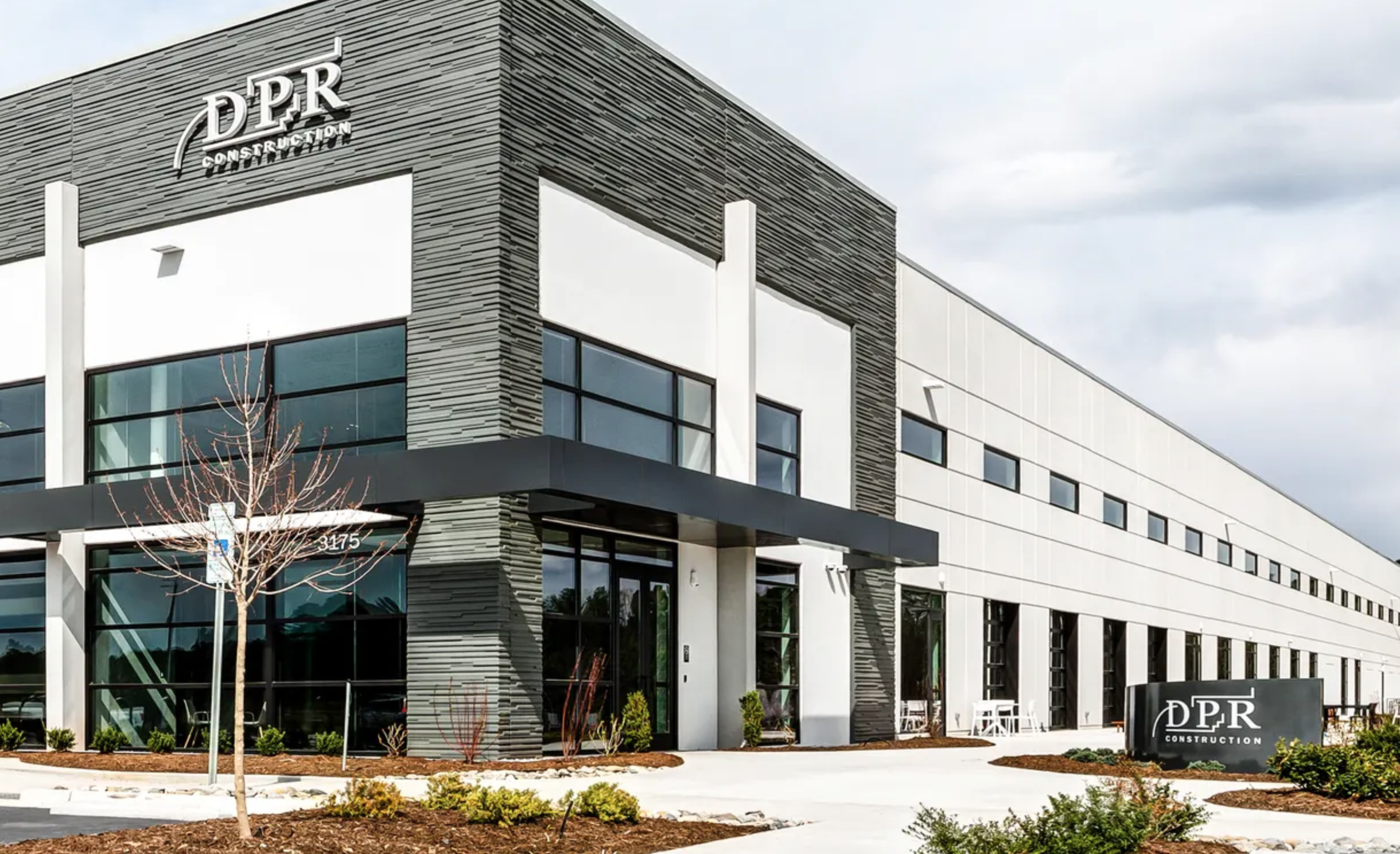
DPR CONSTRUCTION
Design strategy, corporate site, proposal system, site branding and collateral for for an international technical builder.
Role: Creative Director


A Decade of Design
I’ve played a significant role in strengthening DPR Construction’s brand identity by building systems, tools, and templates that empower teams and support winning billions in work.
What began as a role in brand consulting evolved into leading company-wide design strategy as a Creative Director. I’ve led high-impact initiatives, including a full corporate site overhaul, a proposal system redesign, construction site branding, and the creation of flexible design systems. From jobsite signage to investor reports, the work blends strategy and execution to deliver consistent design with measurable business outcomes.
Templates, Libraries, and Documentation
Clothing, Equipment, and Events


Templates, Libraries, and Documentation
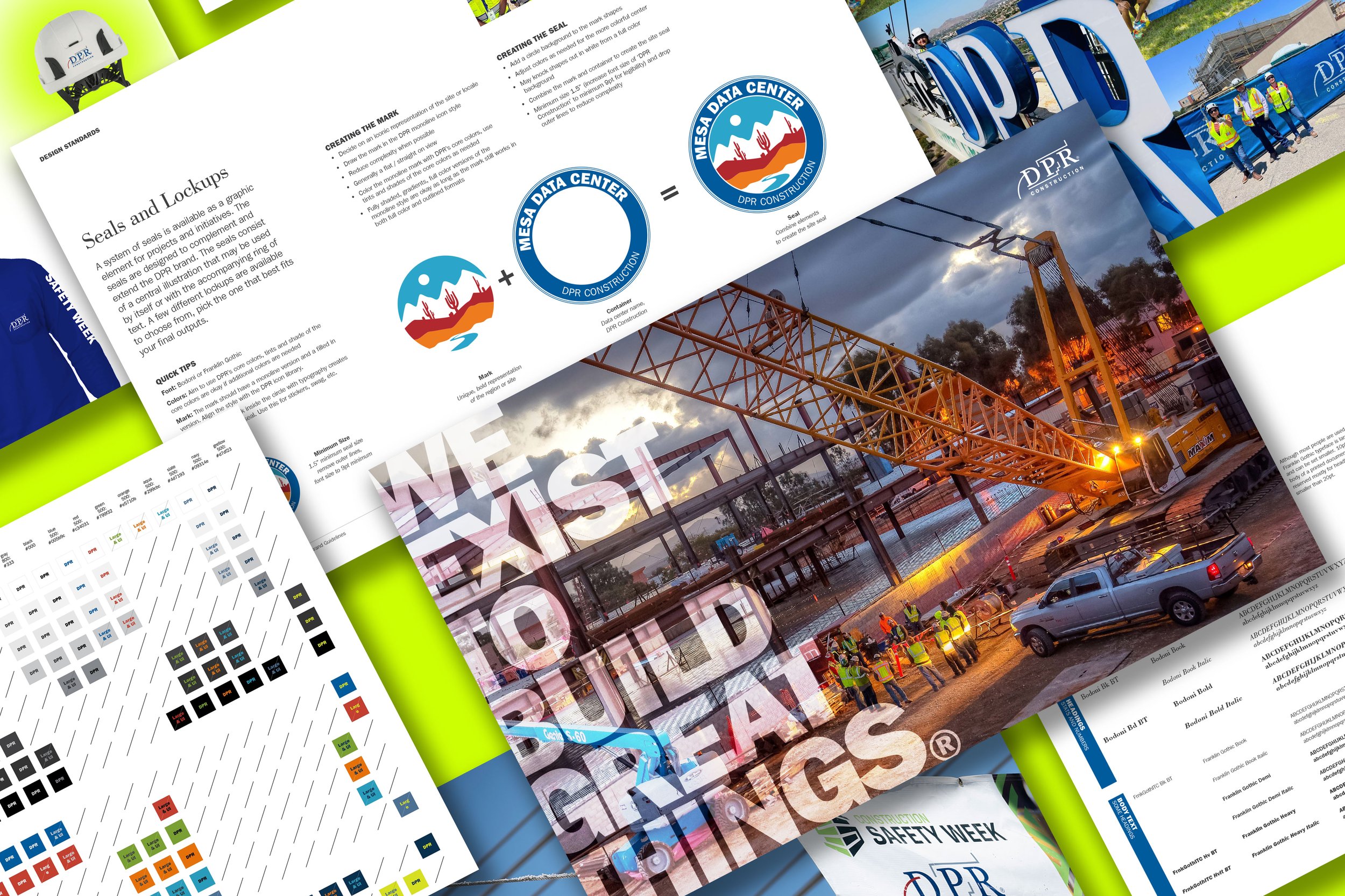
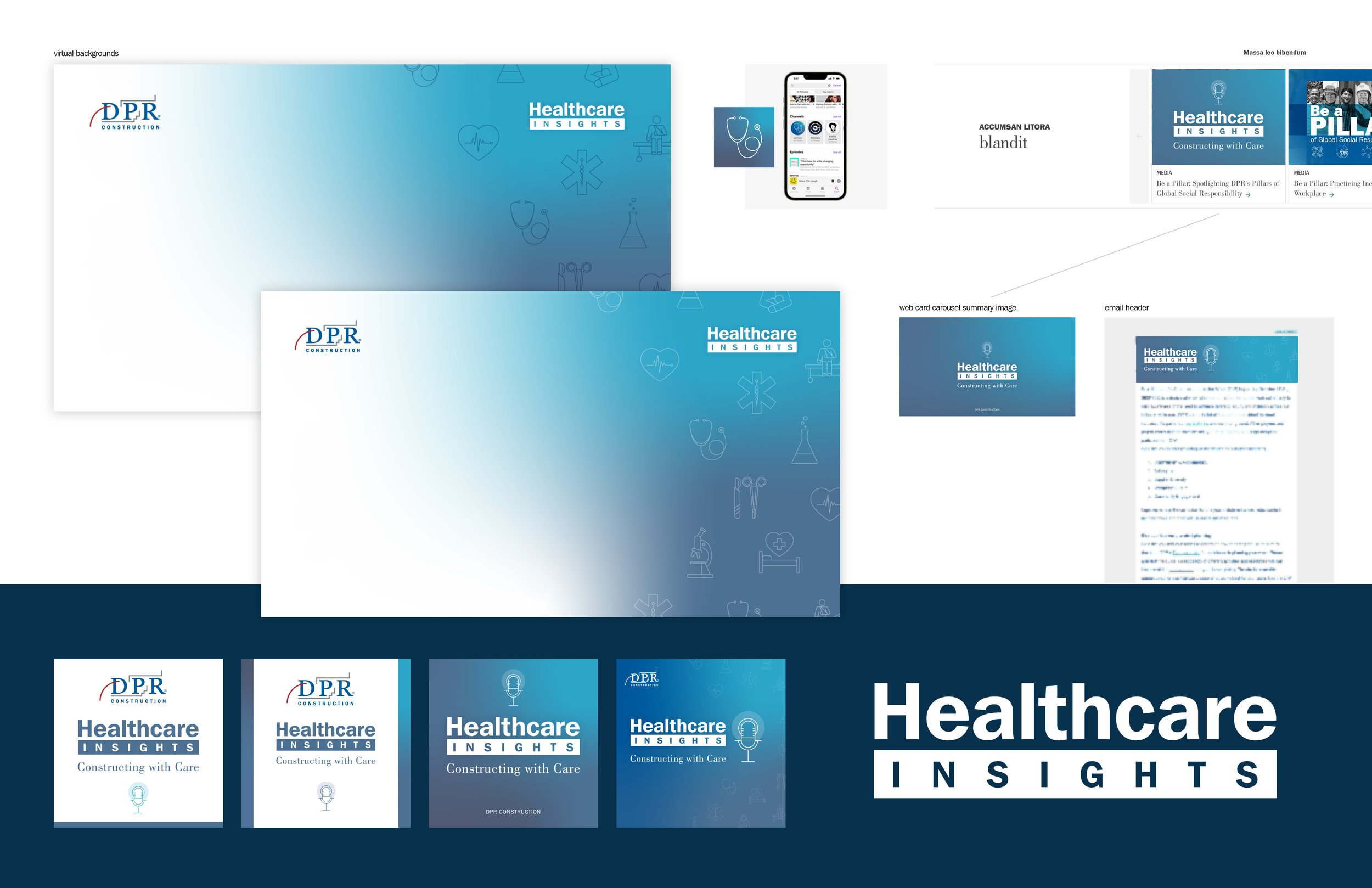
Brand assets: As the company grew, it became harder to identify approved assets and usage guidelines. We addressed this by building a centralized library of vetted brand elements and templates for website content, social media posts, and other materials. This made it easier for teams to create quickly. With flexible core assets, design and marketing teams could more easily execute creative work that aligned with brand standards.
Modernizing brand elements: To accommodate high-resolution screens and varied use cases, we redrew all original IP into scalable vector formats. Alongside refining core assets, we introduced an approachable technical style with new icons, colors, photography, illustrations, and a refreshed tone of voice. This supported recruiting, employee engagement, events, and volunteer initiatives.
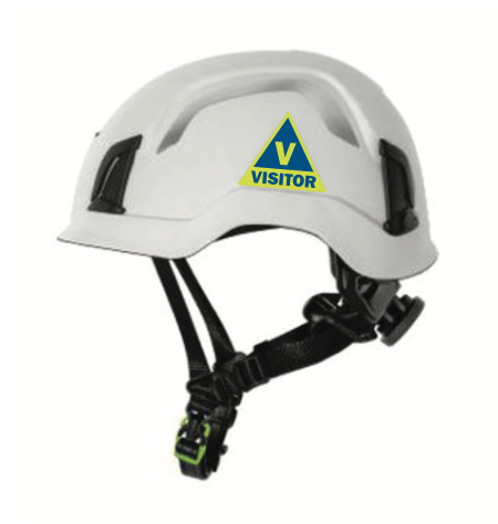
Brand guidelines for colors, typography, project sites, events, personal protective equipment, crane signs, tone of voice, social media best practices and much more.
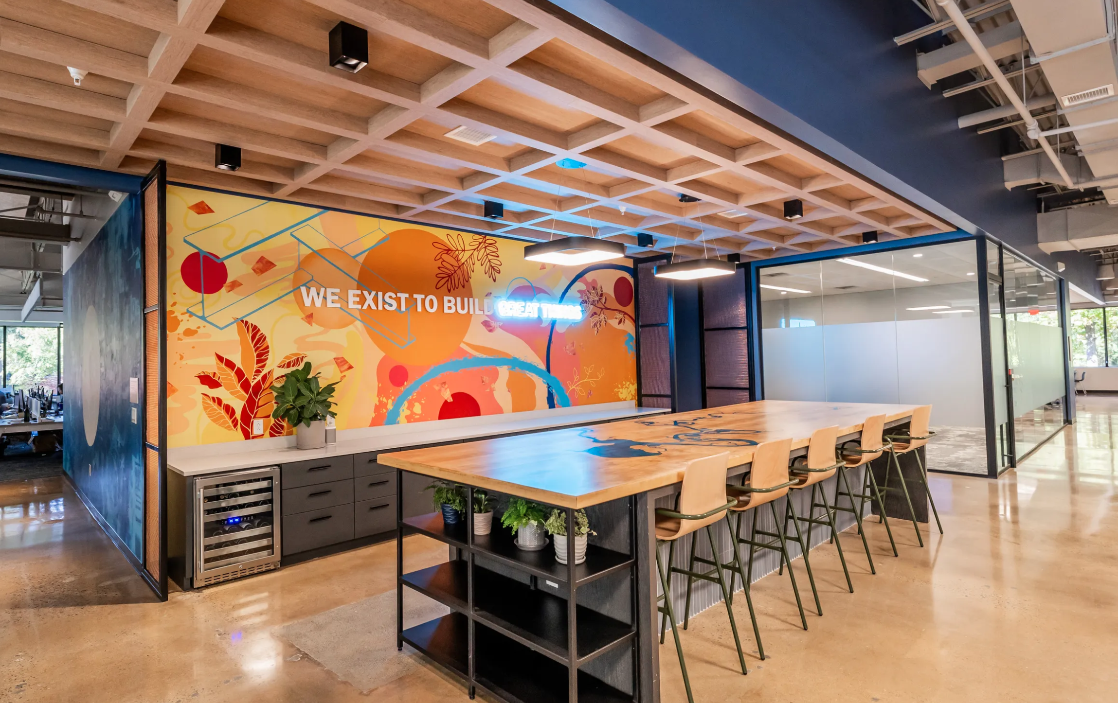
Office graphics prominently feature brand slogans, local photography, custom artwork, energy efficient fixtures and green elements.
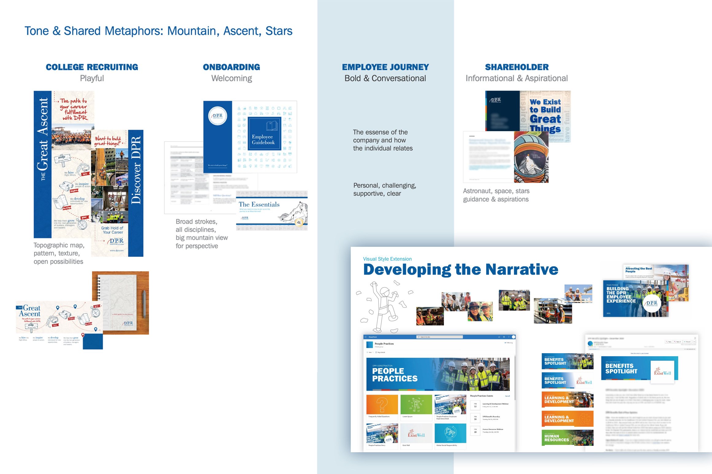
Audience segments to guide new design systems.
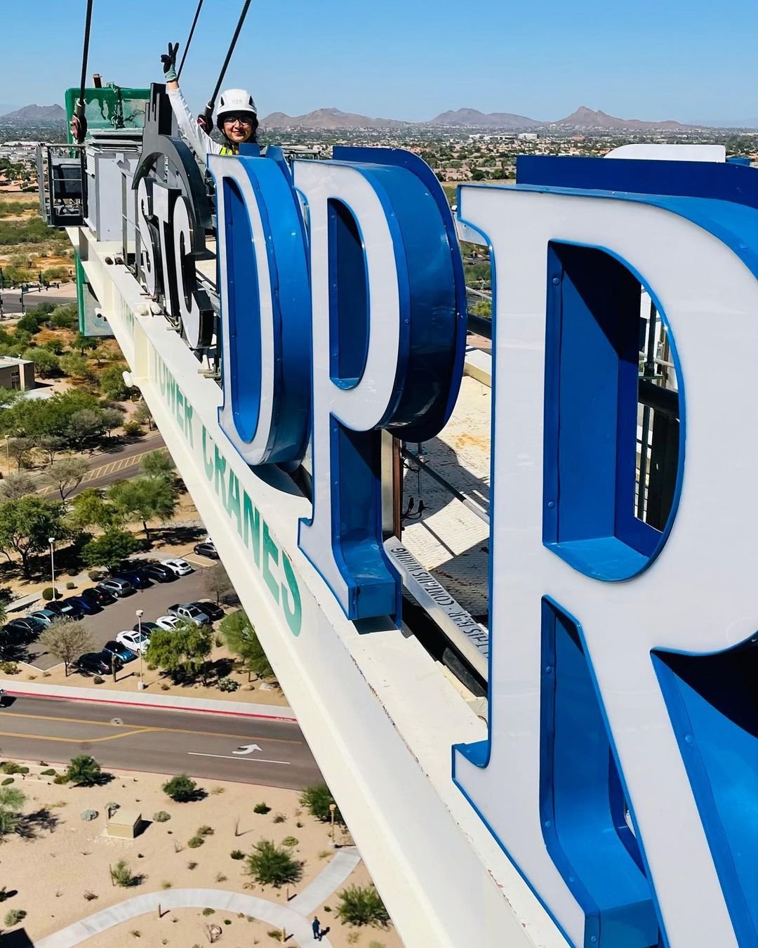
Logo files for large format signs and engravings were accessible to teams for branding new offices.

Milestone years are marked with a celebration seal featured on stickers and gifts to employees and business partners.

Maintaining and updating core IP was done with care to bring it forward without removing the initial vision or intent.

Templates enabled social media teams to quickly post content for events and initiatives.
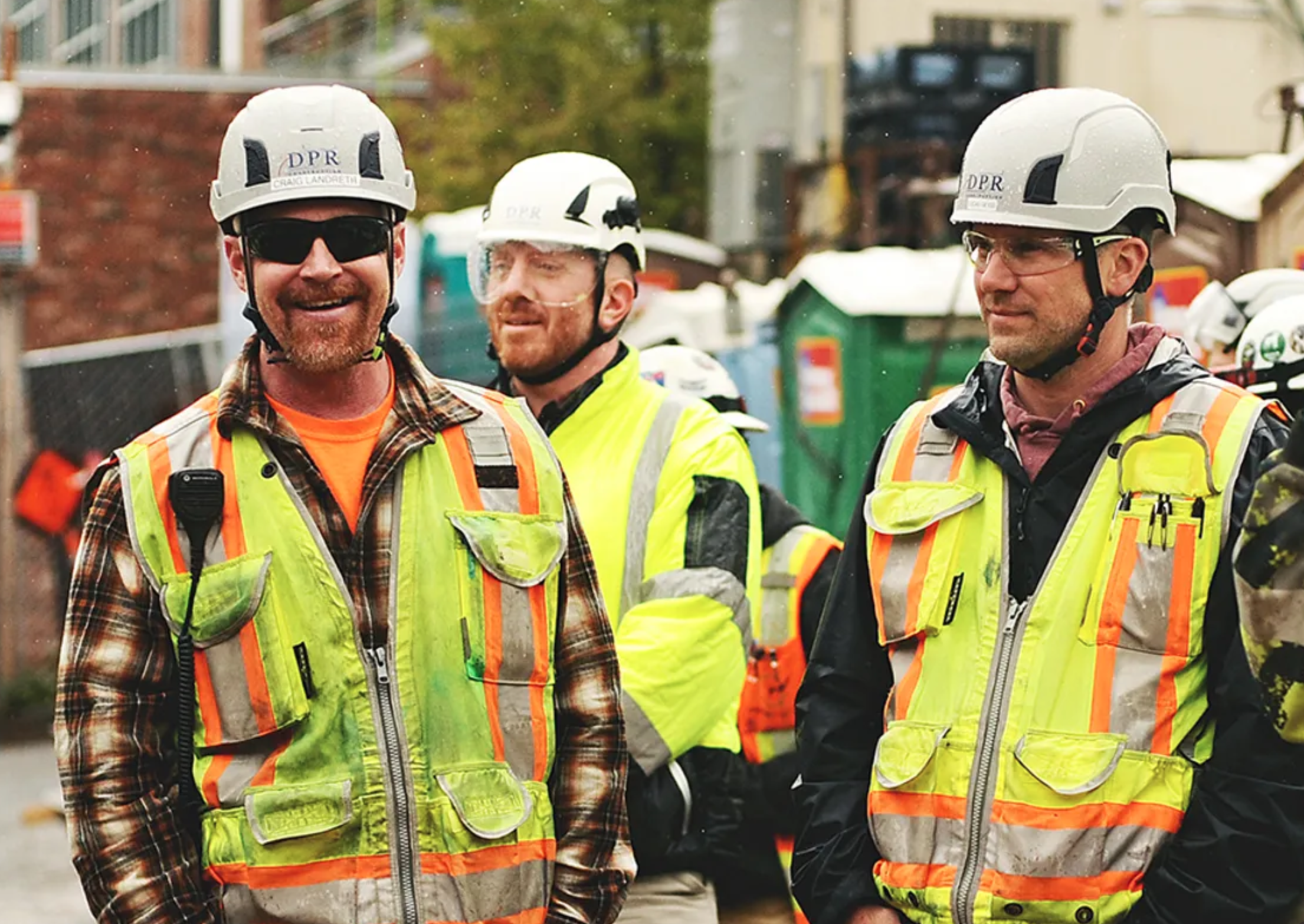
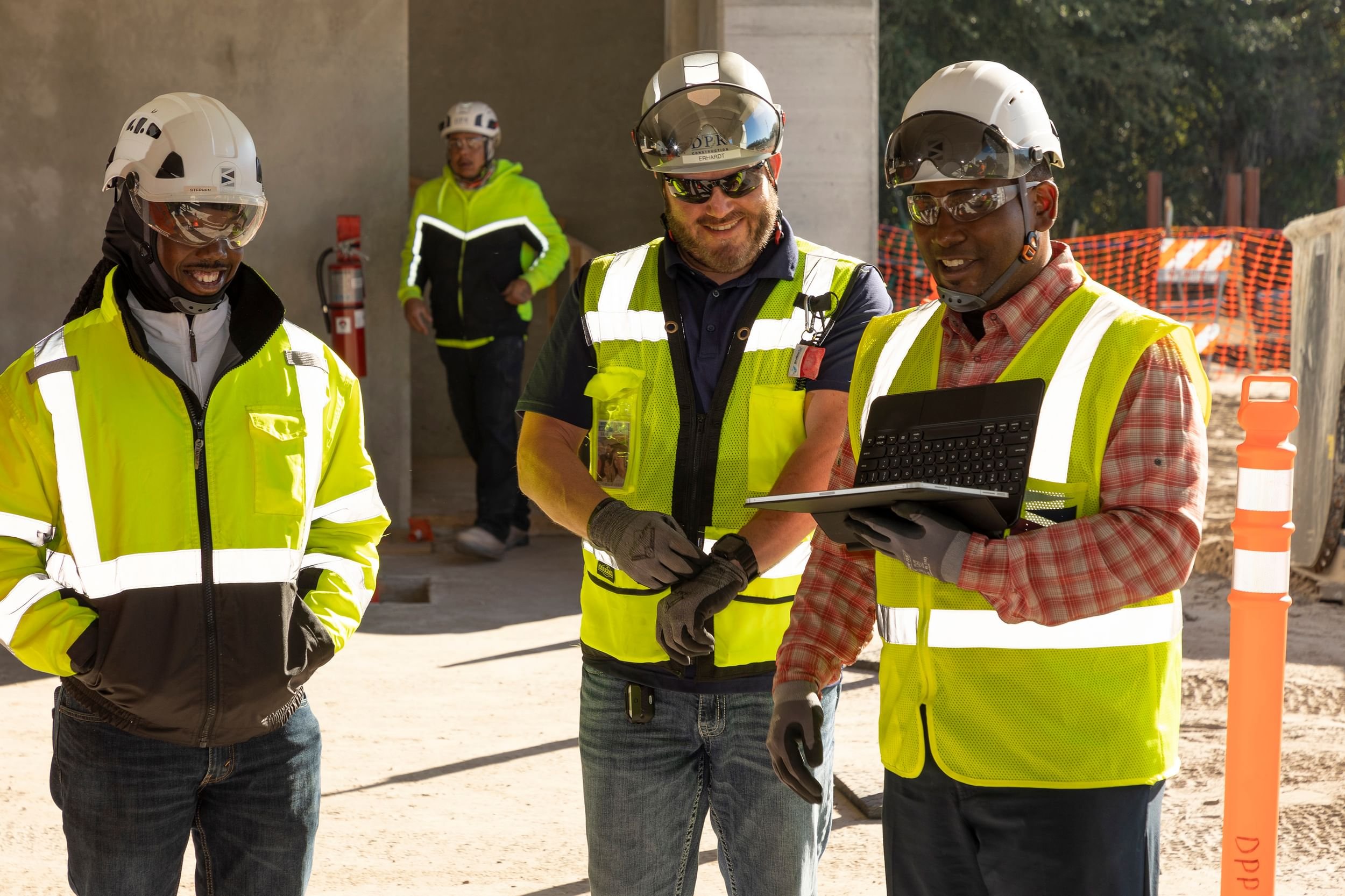
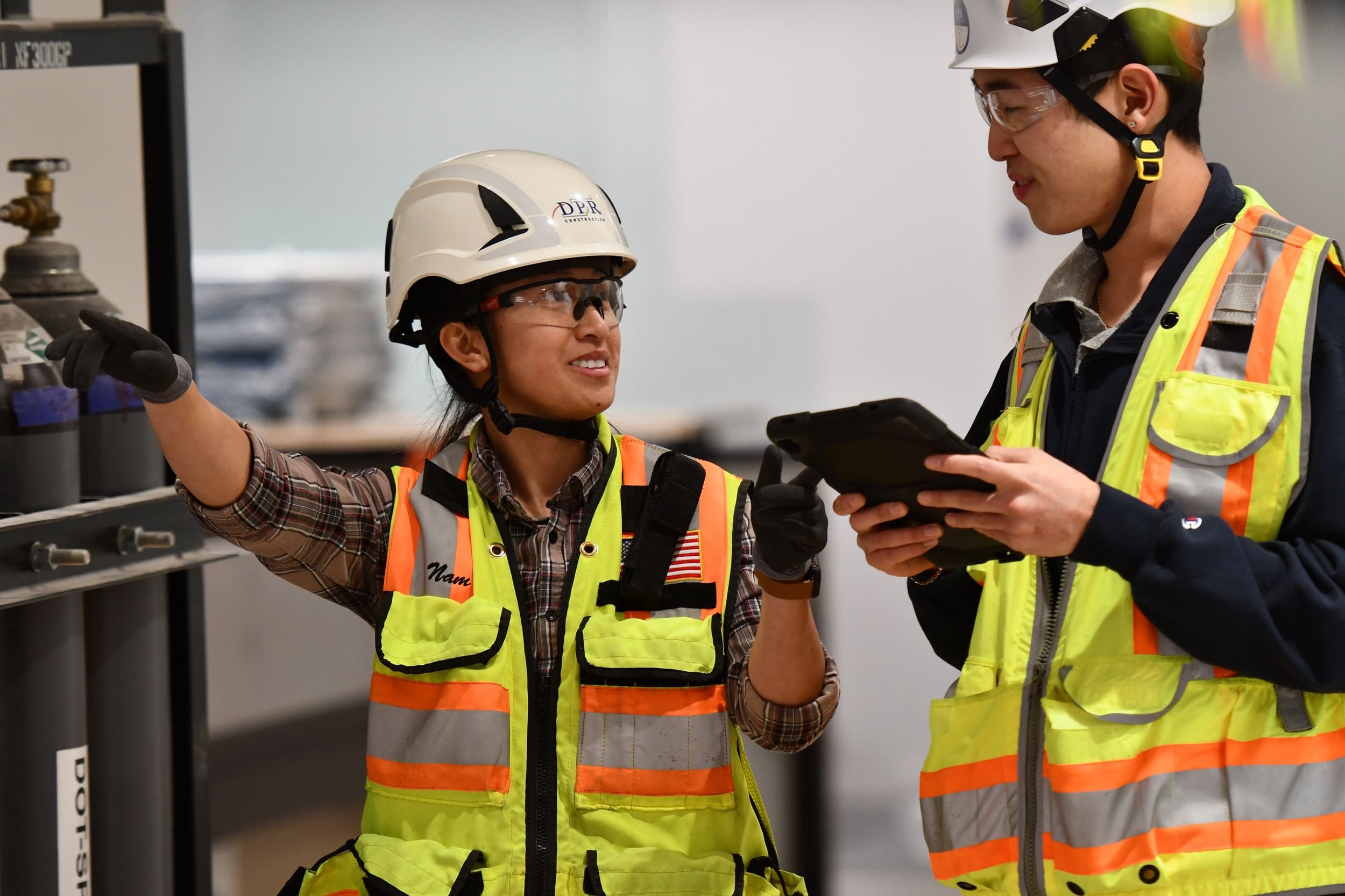
Clothing, Equipment, and Events
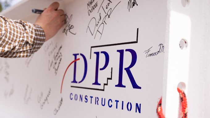
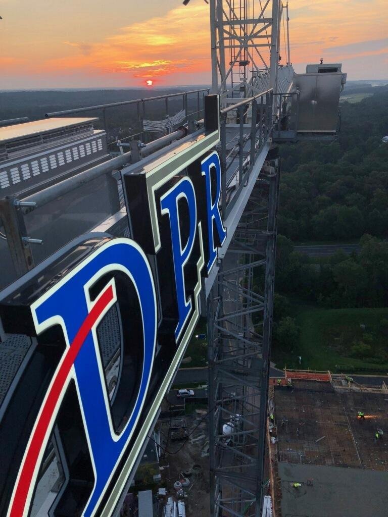
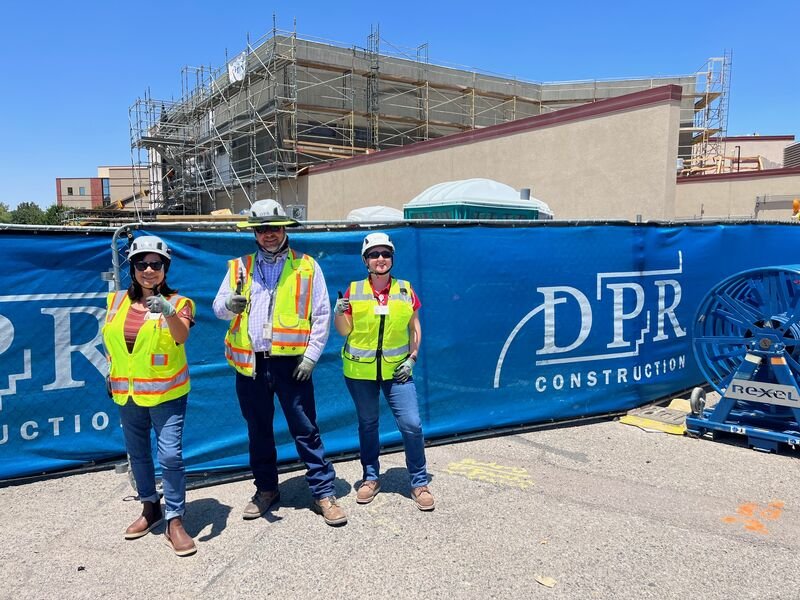
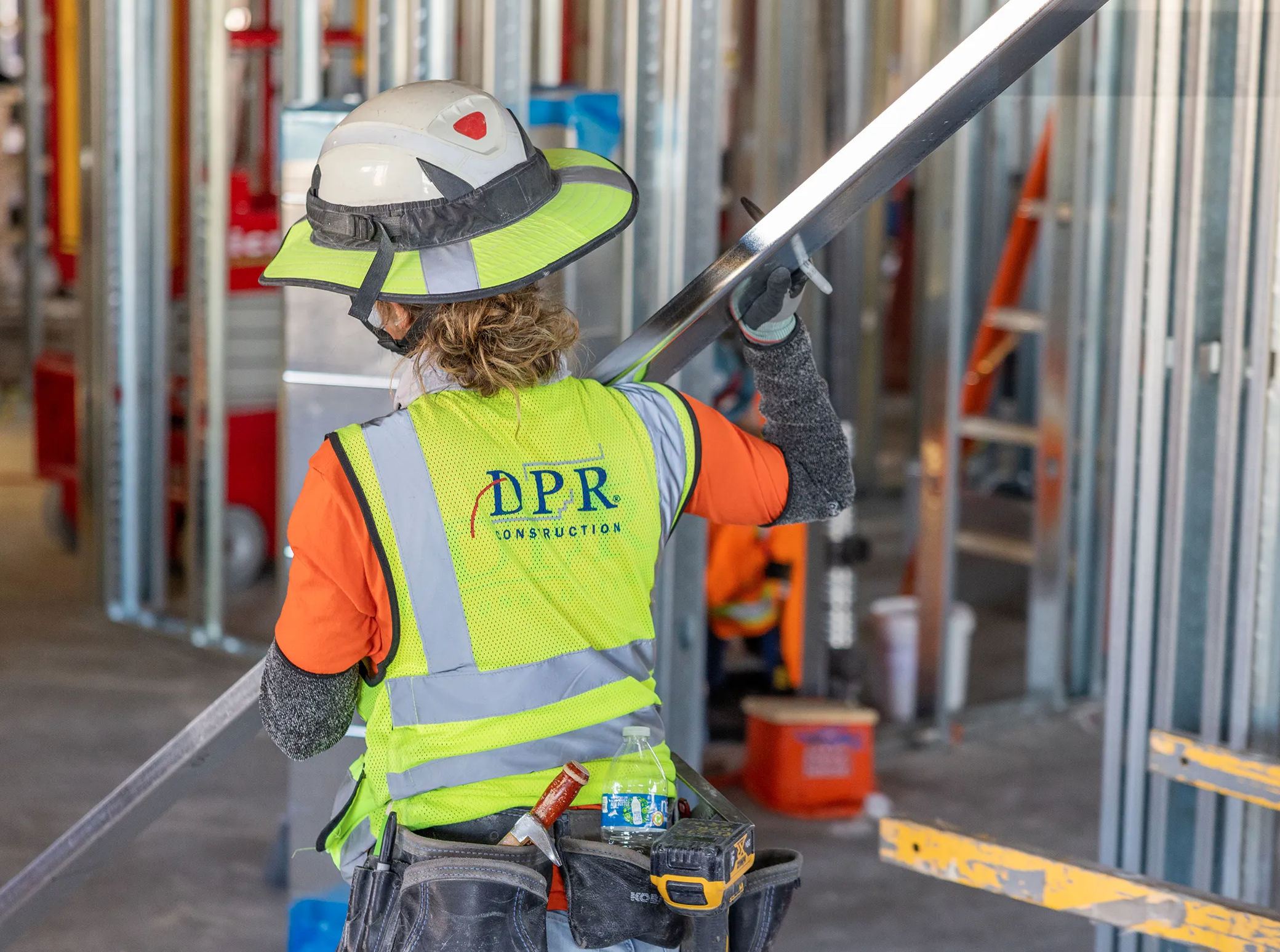
Design and production across materials, from clothing to crane signs.
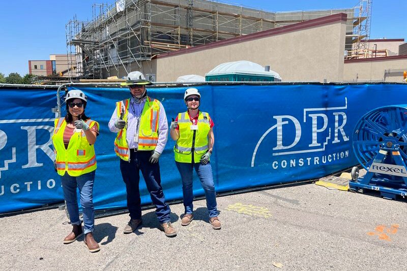
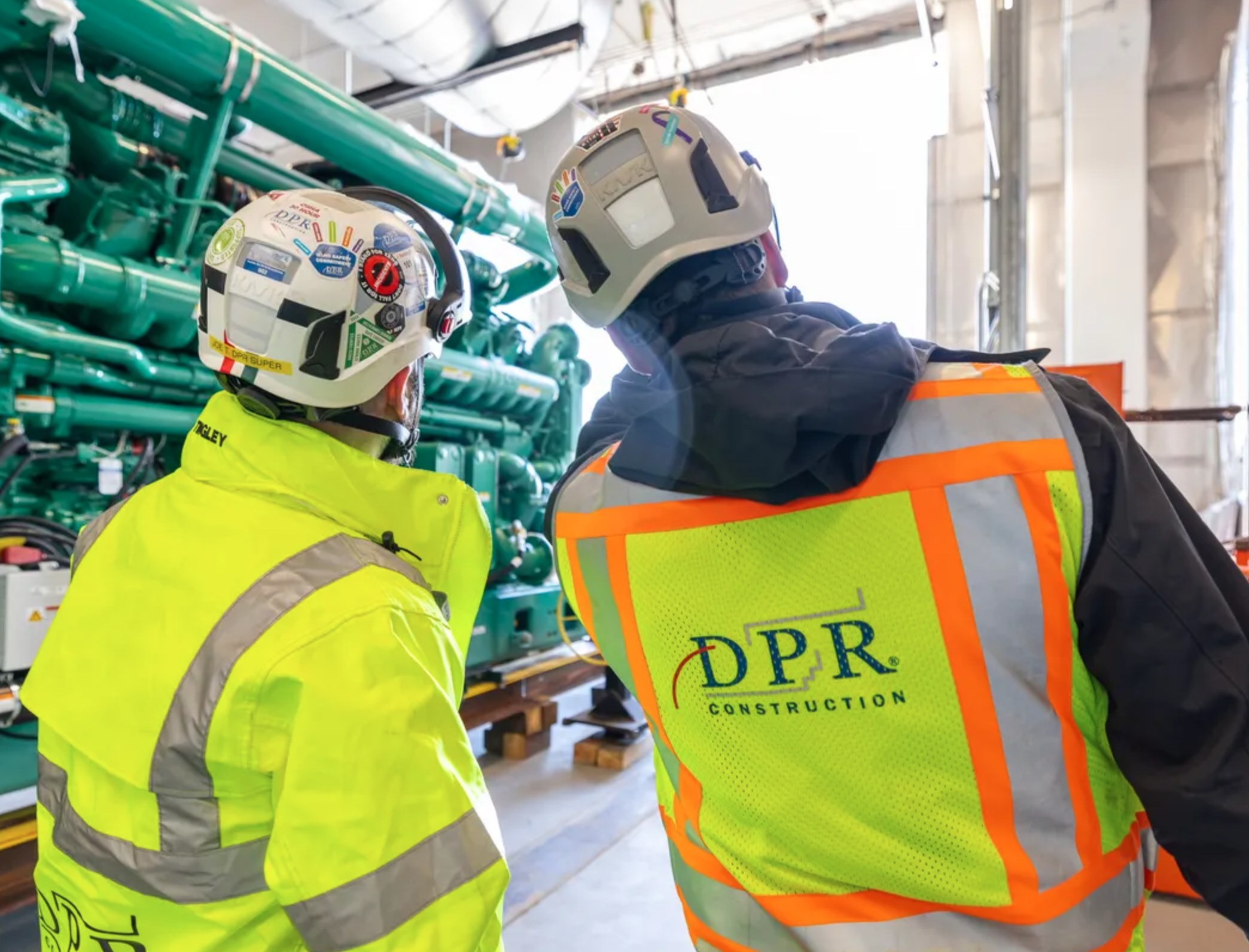
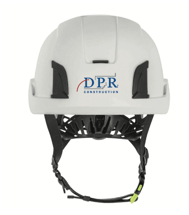
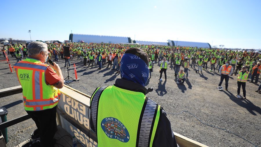
Company Clothing and PPE Overhaul: We redesigned Personal Protective Equipment (PPE) to match a revised jobsite style, selecting vendors based on size range, customization options, and cost effectiveness. Suppliers were chosen to ensure availability, quality, and branding consistency across global locations, meeting the needs of both onsite and office workers.
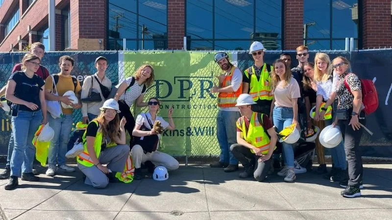
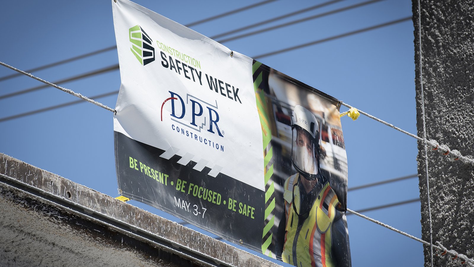
Active Jobsite Branding: Rebranding was a phased process, addressing hundreds of ongoing projects. New sites received fully updated materials, while in-progress jobs were refreshed as schedules permitted.
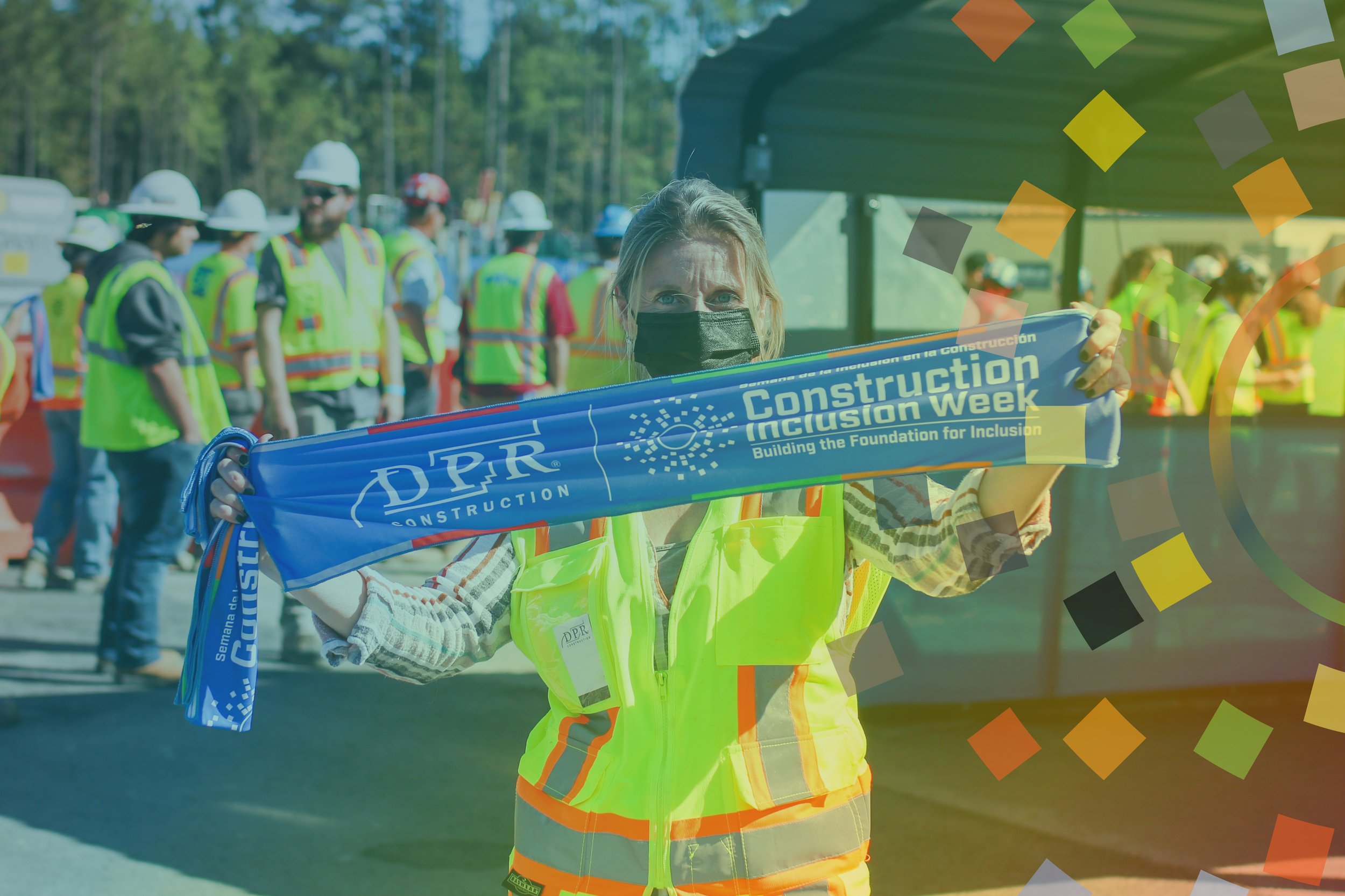
Sustainable Event Materials: We produced practical items like stickers, cooling towels, water bottles, and hats to complement core clothing, ensuring they were suitable for both construction sites and office environments.


Iconography
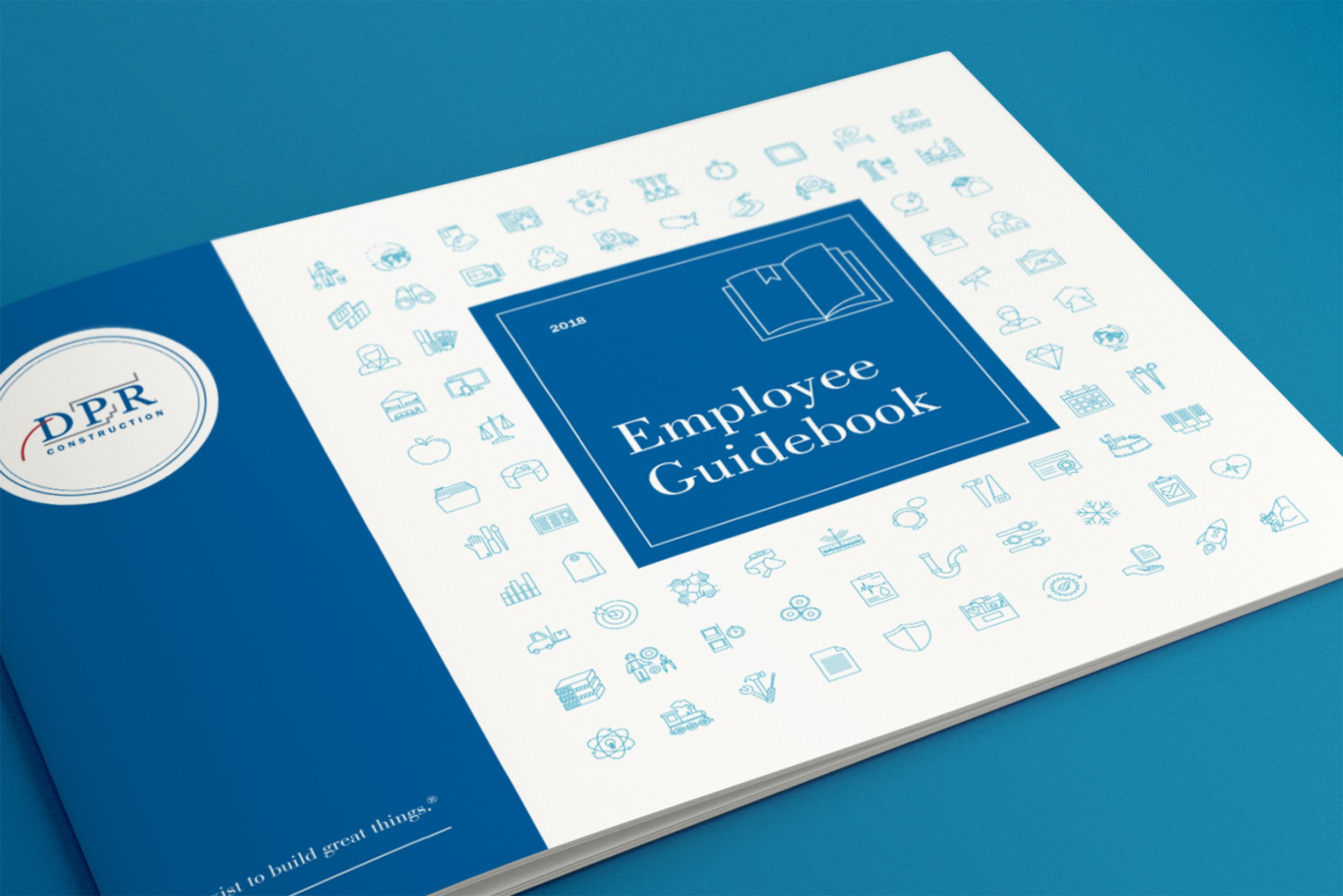
I created over 400 custom icons in a clean, monoline style to ensure clarity, consistency, and versatility across all applications.
These icons appear throughout DPR’s websites, guidebooks, signage, social media, office decor, and swag—an integral part of the brand’s daily expression.
How to create icons that fit within the technically whimsical style.
A selection of industry, benefits and cultural icons in use at DPR.
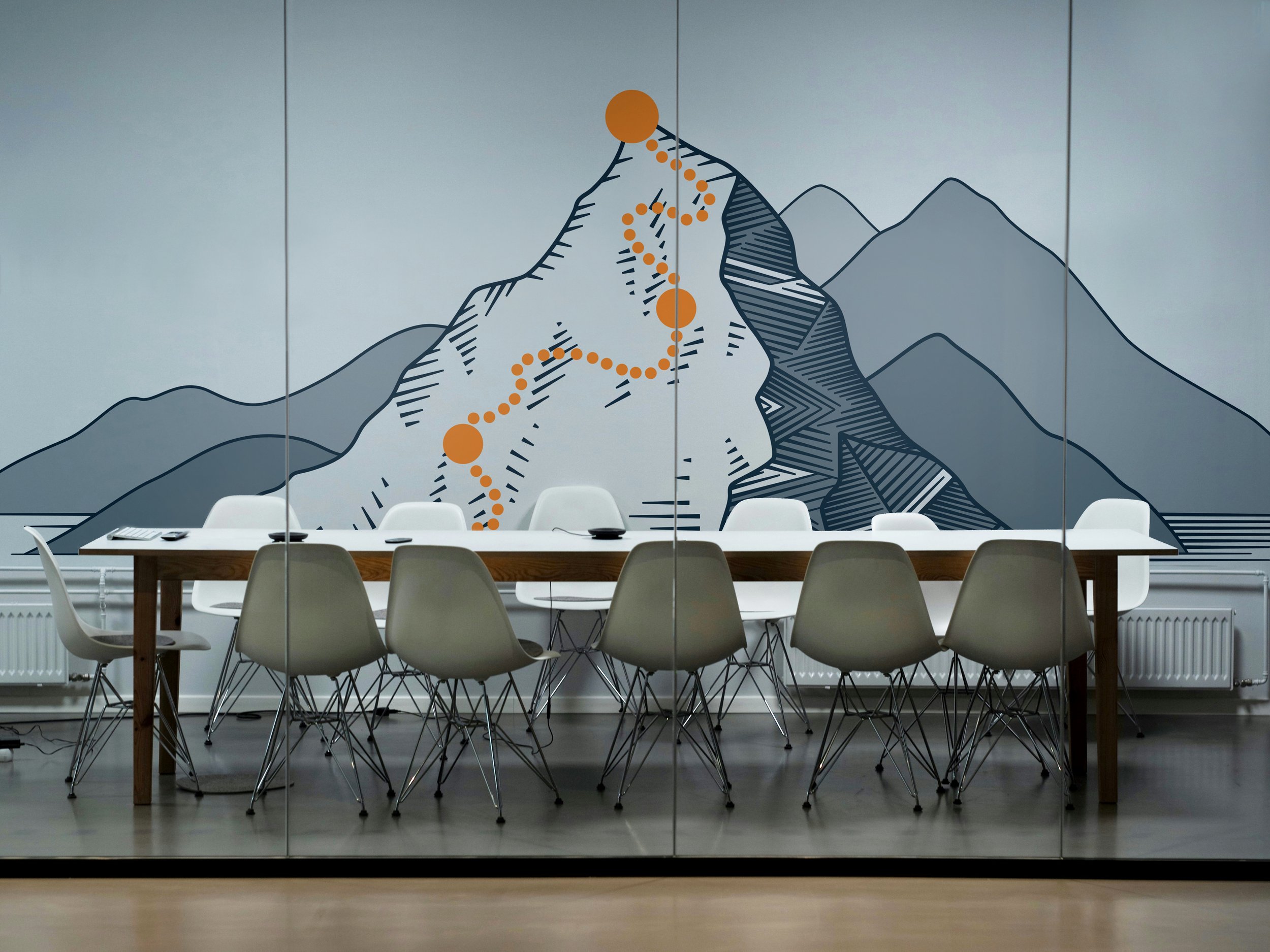
Conceptual rendering of an icon band for a conference room.
Each concept was drawn several times so teams could choose which version conveyed the topic best. Variations were often used in different projects.
Icons on fields of color are used while photos are being sourced or to represent a concept.
Icon textures are a common design element across the company.
Icons are featured throughout the website as design elements.
Formal materials feature icon fields recolored to align with themes and topics.
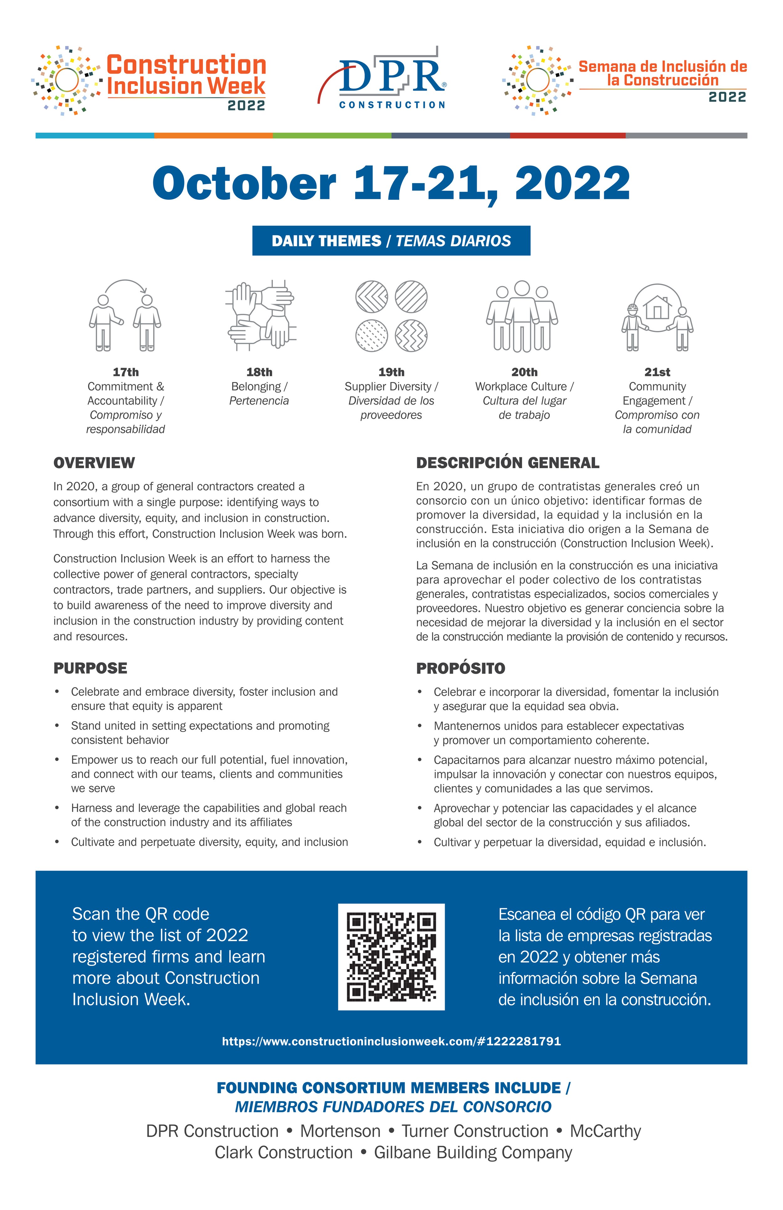
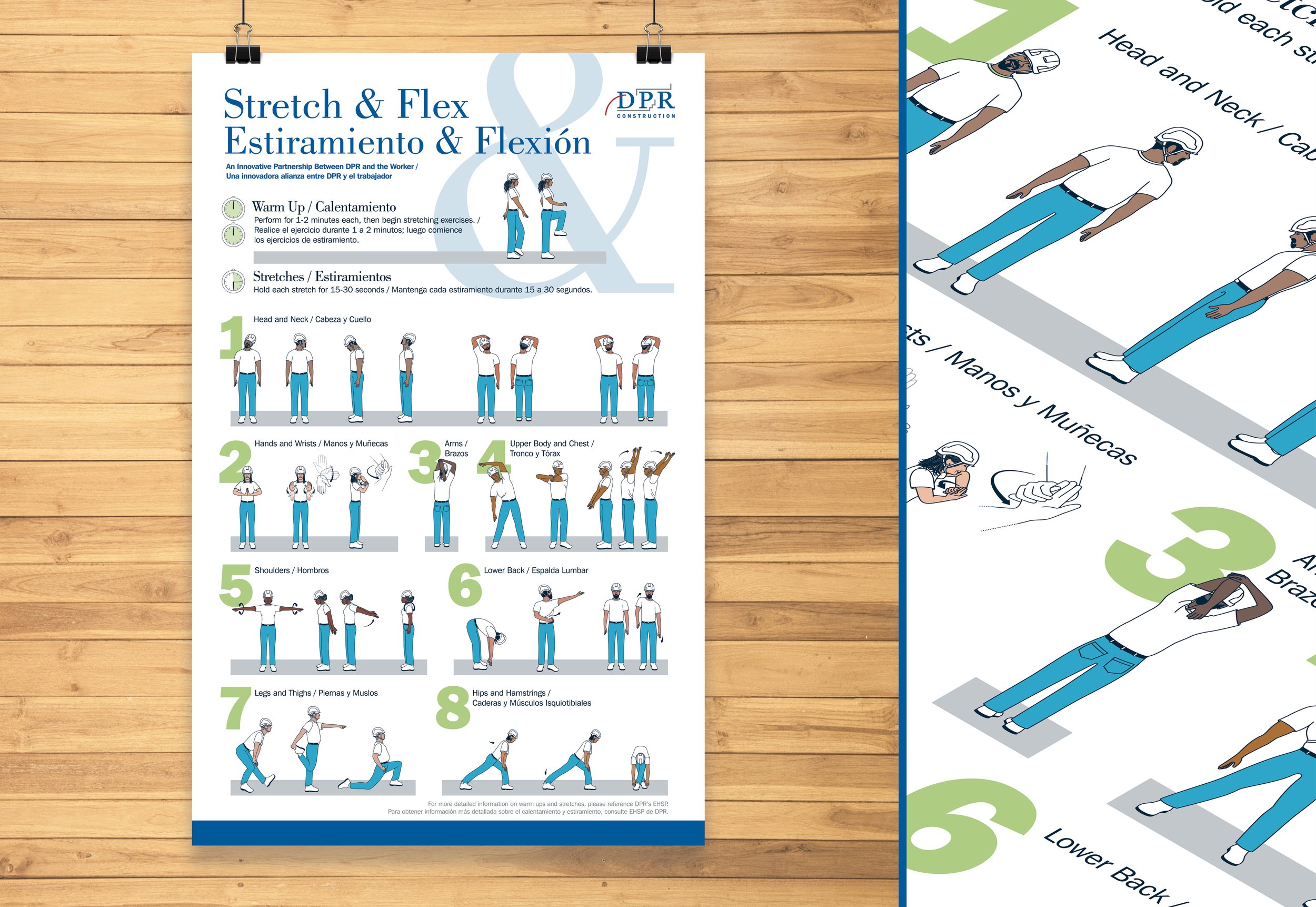
Posters and signs use icons as design elements and to represent concepts for a multilingual audience.
Icons for conference room banner decoration.
Proposal System
A company-wide system used to submit every proposal, used by hundreds of employees across DPR and its extended family of companies.
Originally designed in 2016 and refreshed in 2022, the system includes digital and print formats, supports US and ISO standards, and is optimized for a range of skill levels. The redesign was informed by direct employee feedback, with features tested on live pursuits for continuous improvement.
Proposals are built for flexibility—accessible, screen- and print-ready without reformatting, with embedded navigation, CRM code support, and an internal Adobe Library integration to streamline submission and review.
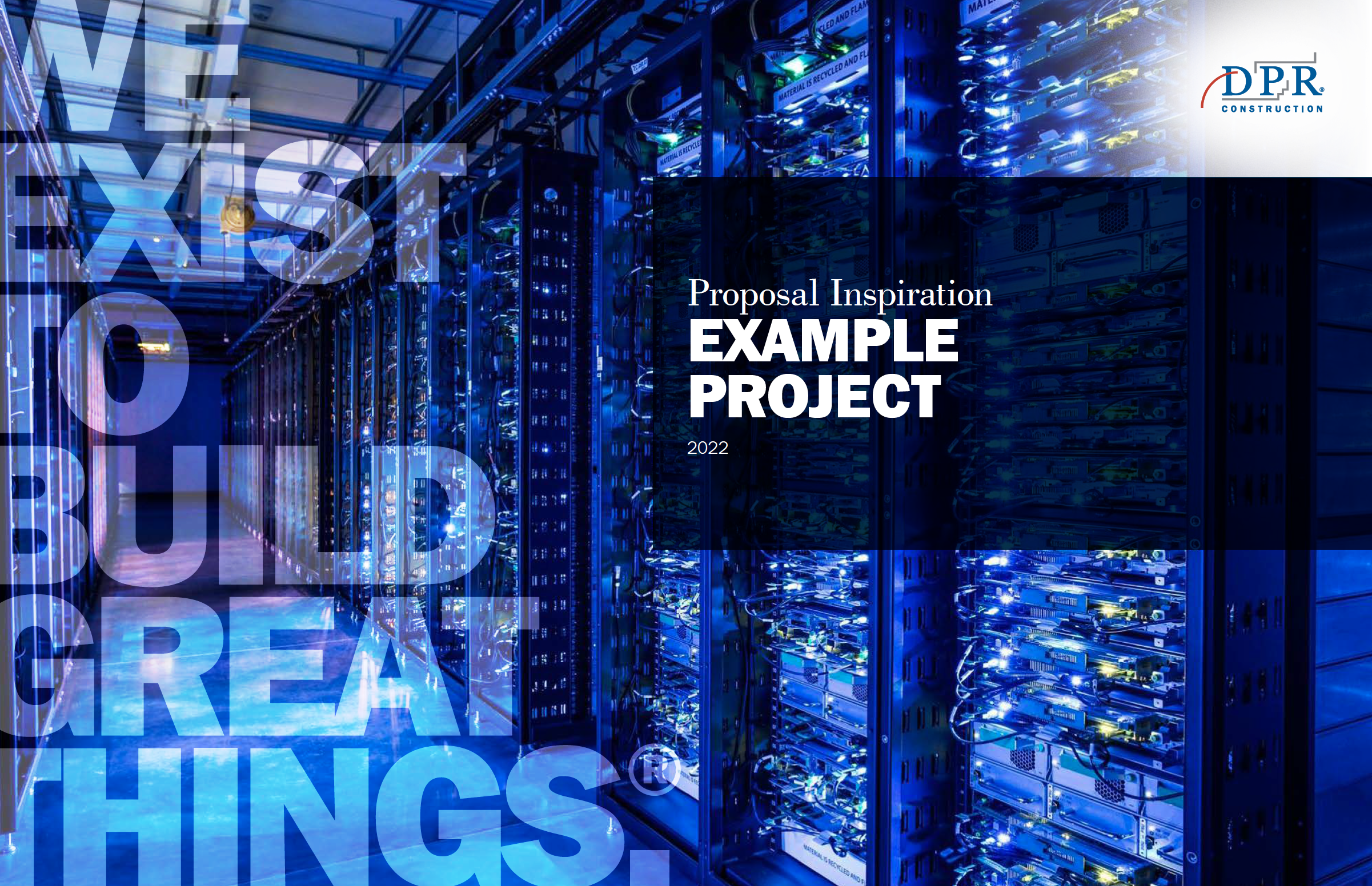
Example decks and generic layouts were created for marketers to quickly assemble proposals.

Example pages recolored to match core markets and showcase layout flexibility during the design process.
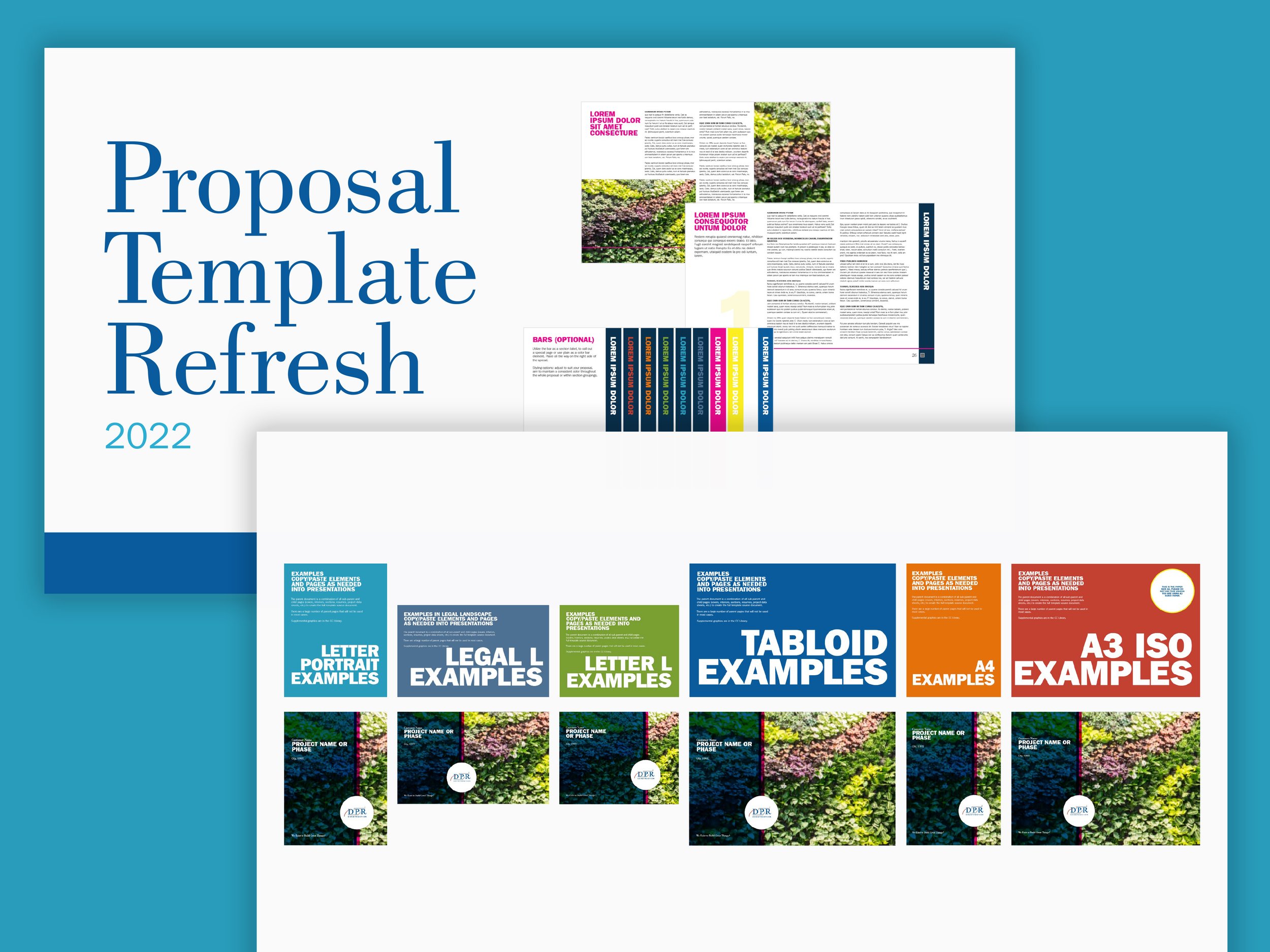
Each format had custom design templates and example decks.
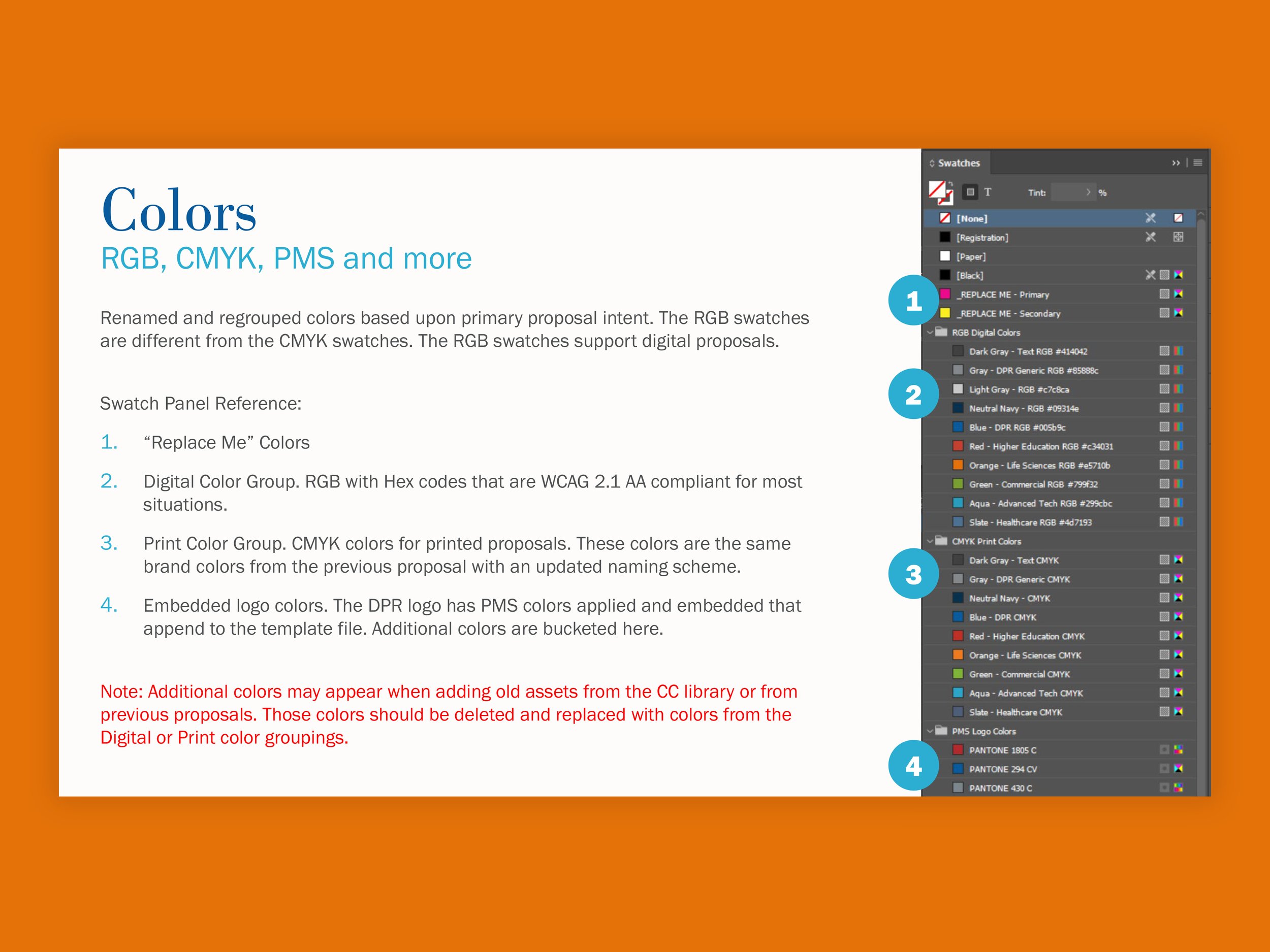
The entire proposal was designed to be quickly recolored by replacing the neon placeholders. Each core market has a predetermined color scheme.
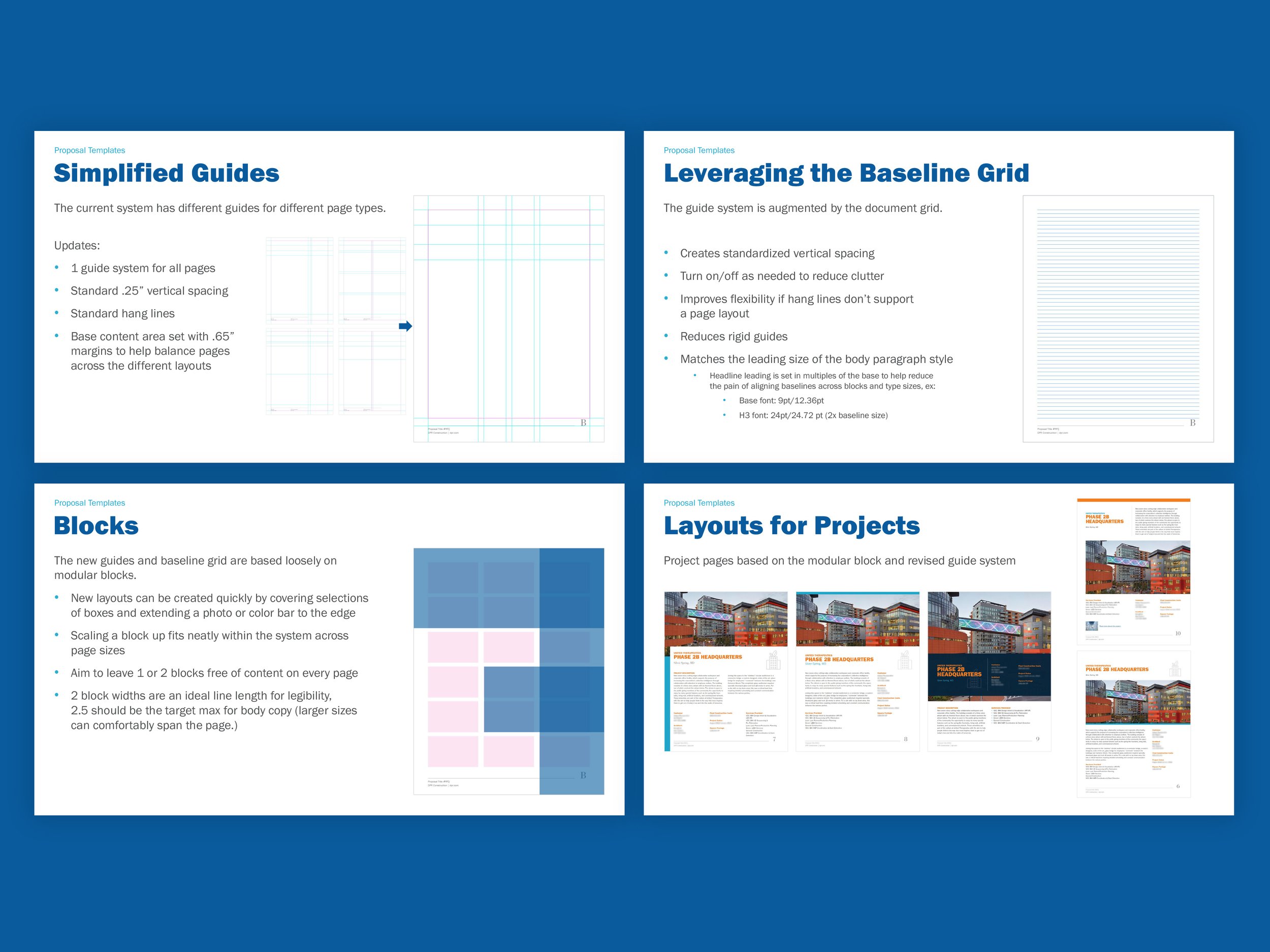
Guides, grids and block areas were all available to help marketers create proposals.
Great Things
Optimizing the design process for a celebratory trade publication.
This owned media strengthens connections with employees, suppliers, trade partners, and project owners by celebrating major projects, company culture, and construction innovation. Positioned to boost employee engagement and deepen trusted relationships, it helps drive repeat business and reinforce DPR’s industry leadership.
Collection view and cover for issue 8.

The base template consisted of pages that could be easily referenced and swapped to build an edition.
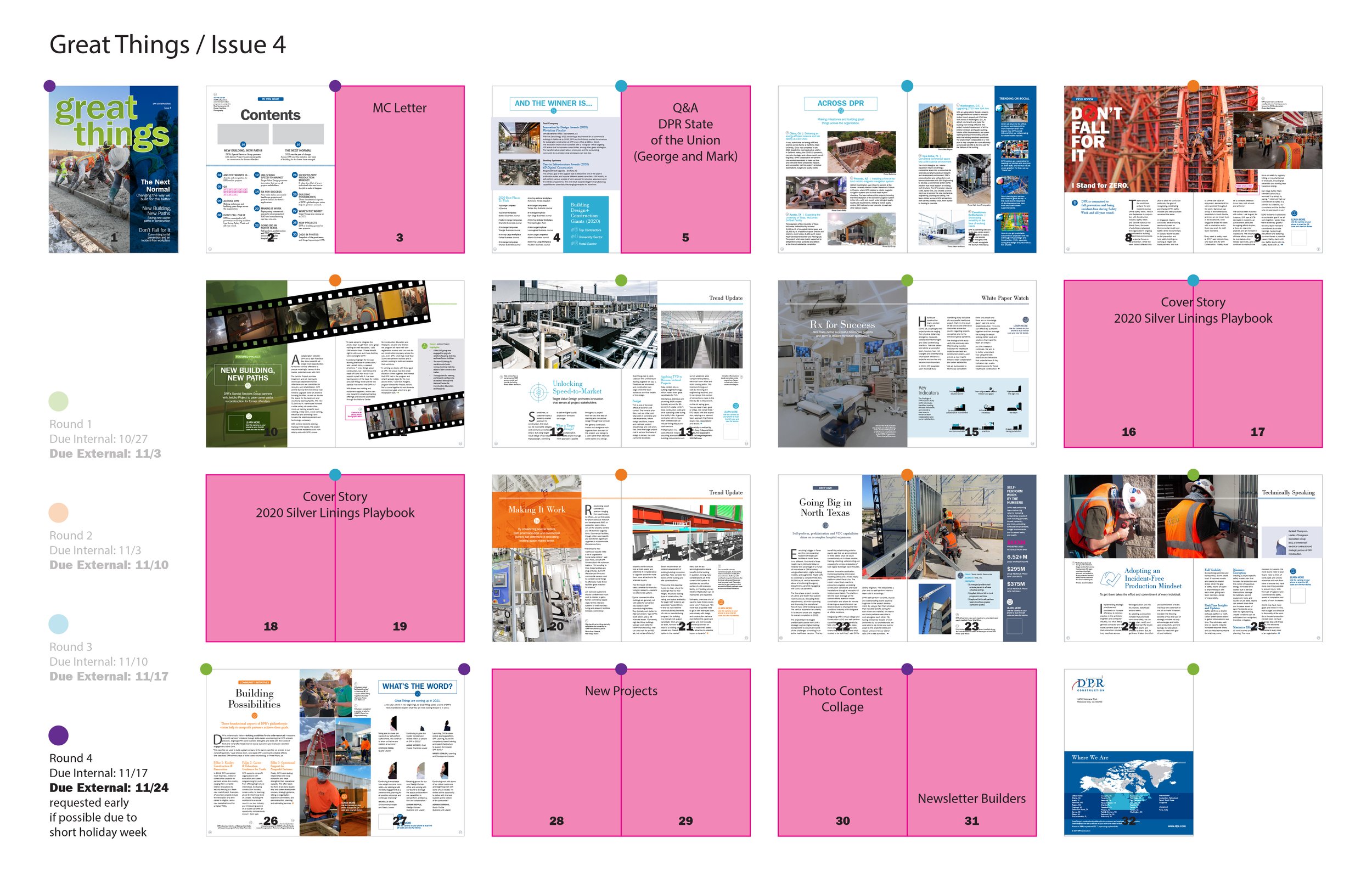
An example of a flatplan with risks identified.

Stories for print are edited for length, with links to the full story online.

The entire story is presented on the web, along with photos and videos.
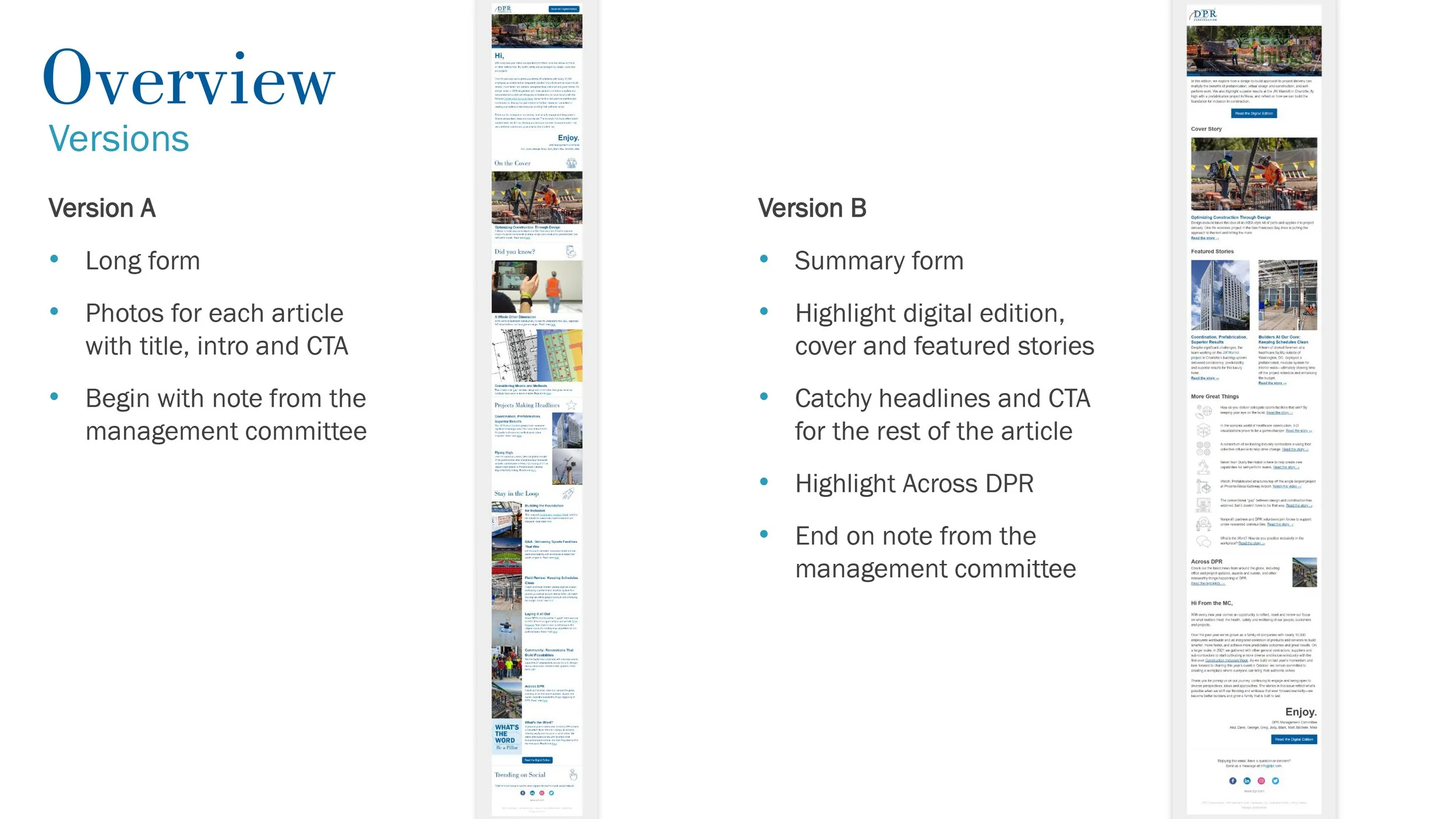
An example of an A/B test we ran through Mailchimp.
A collection was designed as a view of the media feed, consisting of existing entry types. Leveraging components in production, only a few new visual elements were needed to create the collection experience. The primary lift was CMS feature development.
dpr.com Redesign
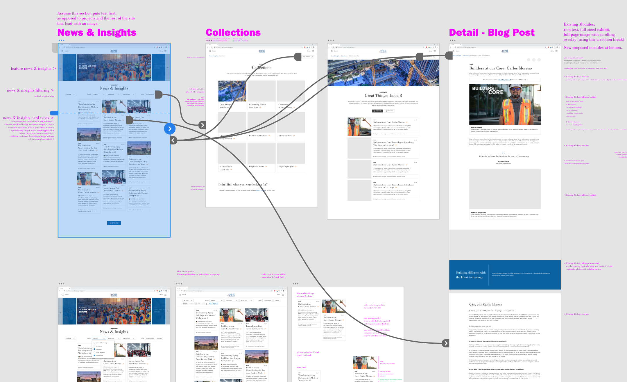
With a digital footprint spanning decades and 800+ projects, the original redesign had stalled under its own complexity. I led the initiative toward an accessible site that highlighted interesting projects and a wealth of great photography.
The result: WCAG 2.1 AA compliance, faster publishing through improved author workflows, and a site architecture aligned with recruiting and business development goals. The redesigned site is built with a customized headless CMS and reusable component system—supporting over 1 million unique page views annually.

Responsive home featuring large photography, driven by a customized headless CMS.

Design analysis and recommendations to improve the mobile UX of the existing site.
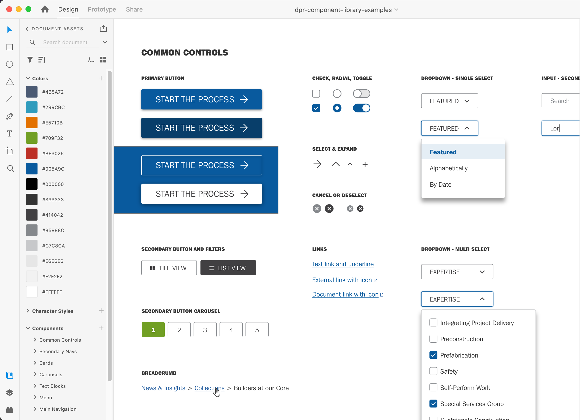
Sample components from the library. More instances are available for different use cases.
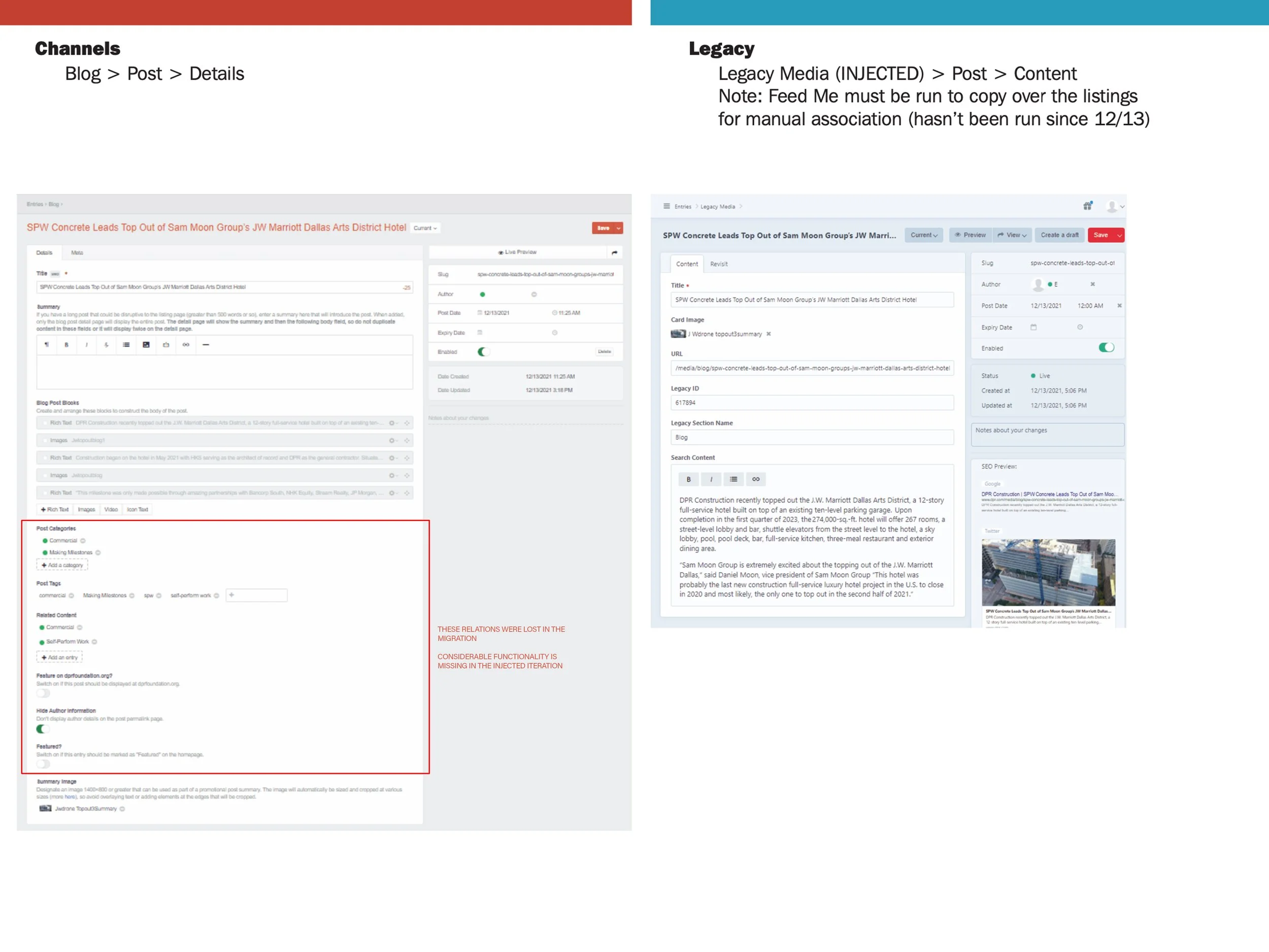
The front end design budget was redirected to rebuilding the customized CMS and migrating content to fix missing functionality and relationships.
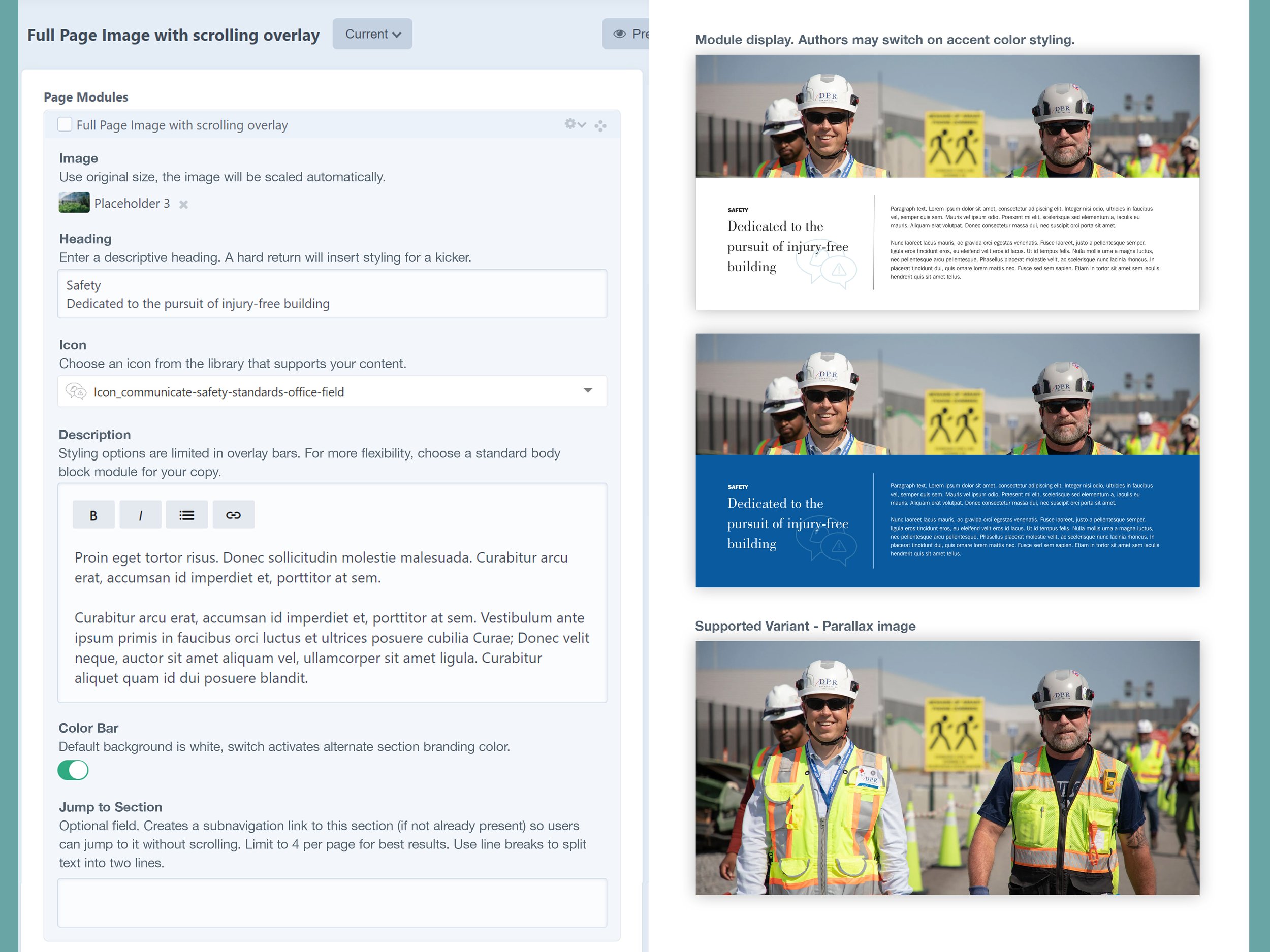
To minimize additional costs, the existing website was deconstructed into modules and text blocks that could be reused to create new views. Organizing and documenting components accelerated design work.
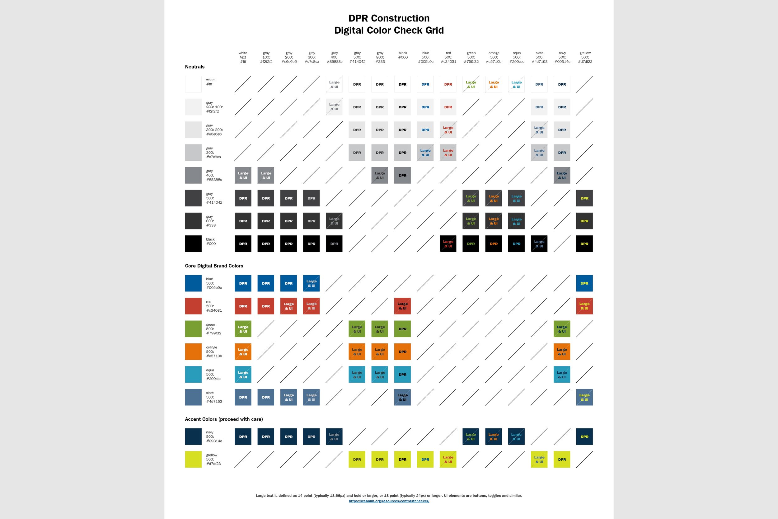
Redesigning the site included a complete overhaul of colors and font sizes to be WCAG 2.1 AA compliant. This color check grid is a quick reference to help people create visually accessible web content.
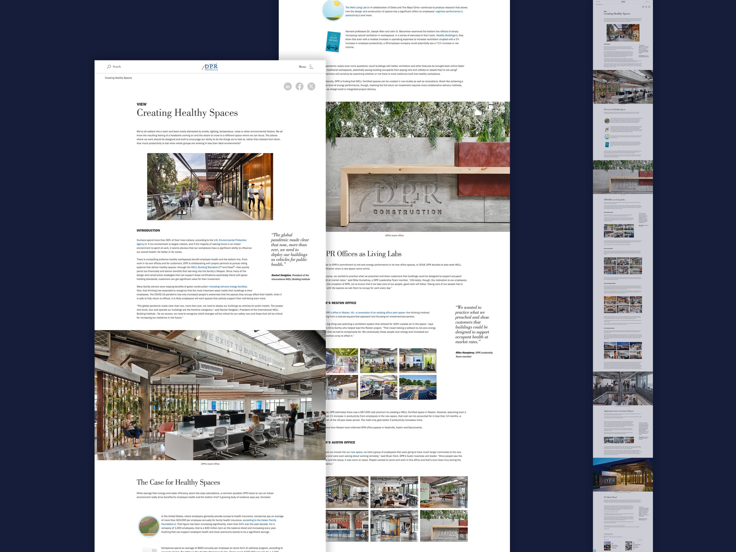
We designed the site to feature our extensive library of professional project photos.
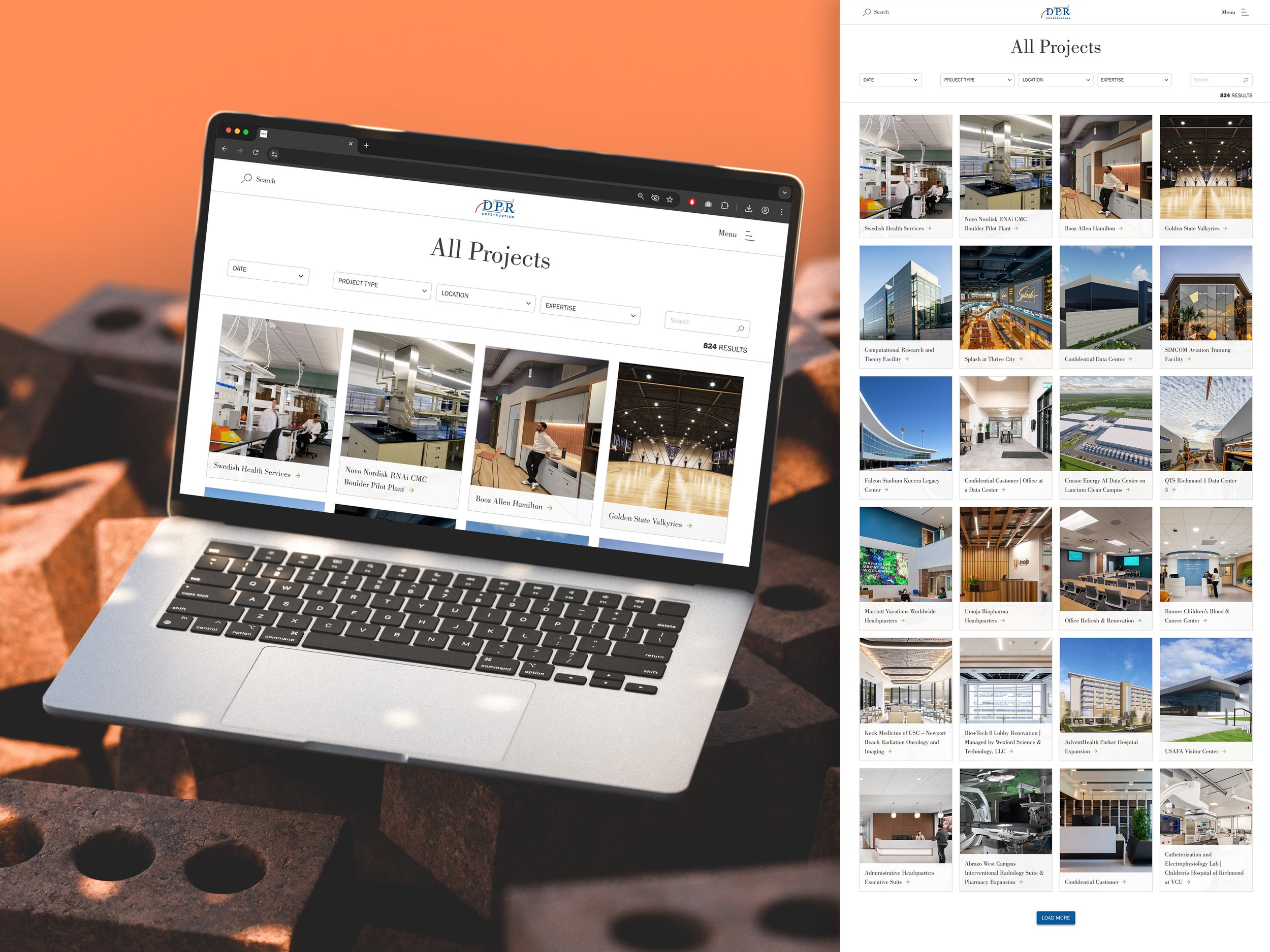
Filters and pagination were introduced to handle over 800 project listings.
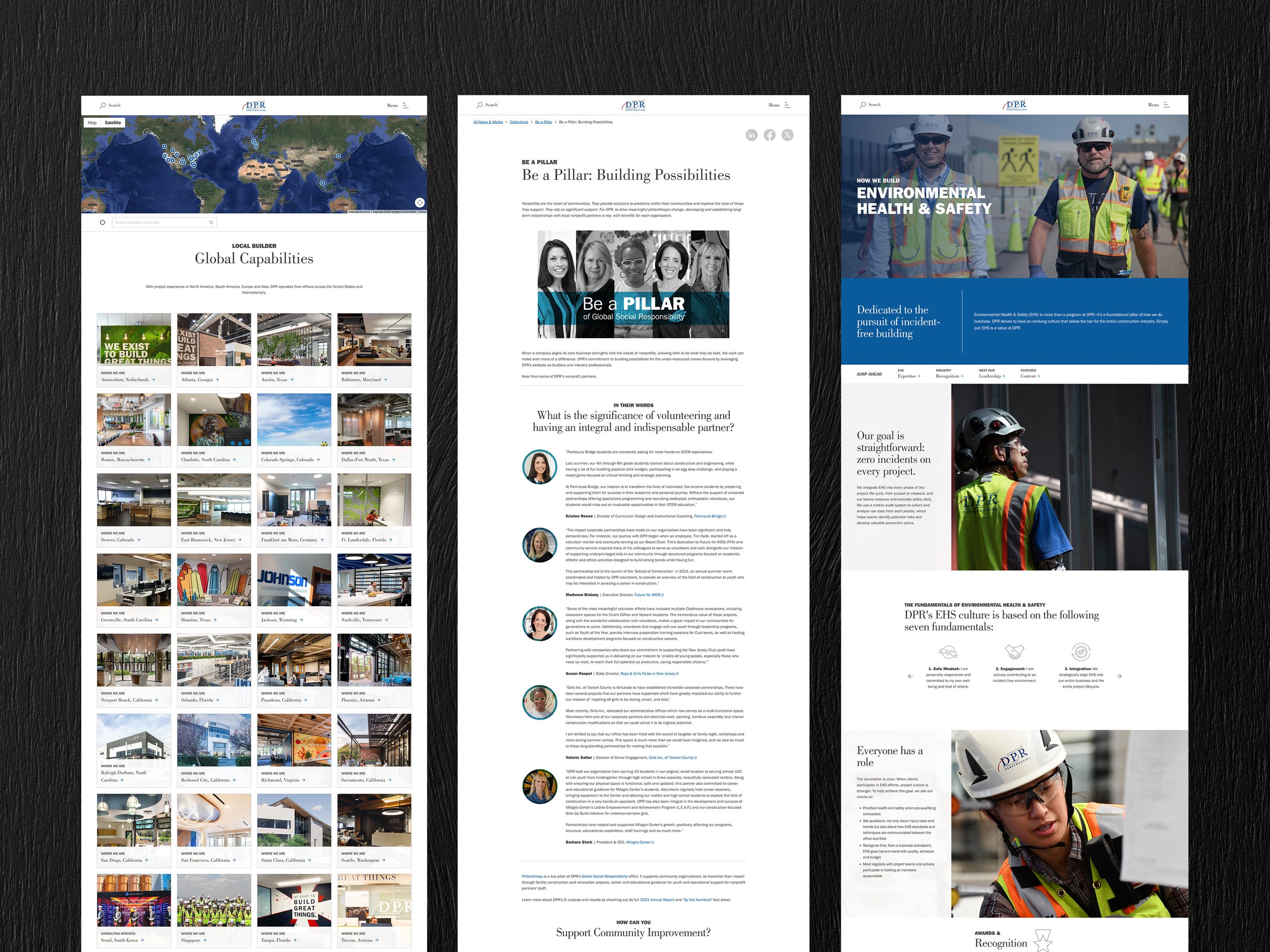
The site design puts imagery front and center, while balancing story pages with long form content.
Presentations and Training Materials
Developed presentations and training assets that ranged from internal briefs to polished event decks. Covered key topics including best practices, annual performance, project milestones, instructional content, and end-of-project reporting to deliver clarity, alignment, and impact across all audience levels.

A diagram used to explain how a phased release could be implemented during app development.
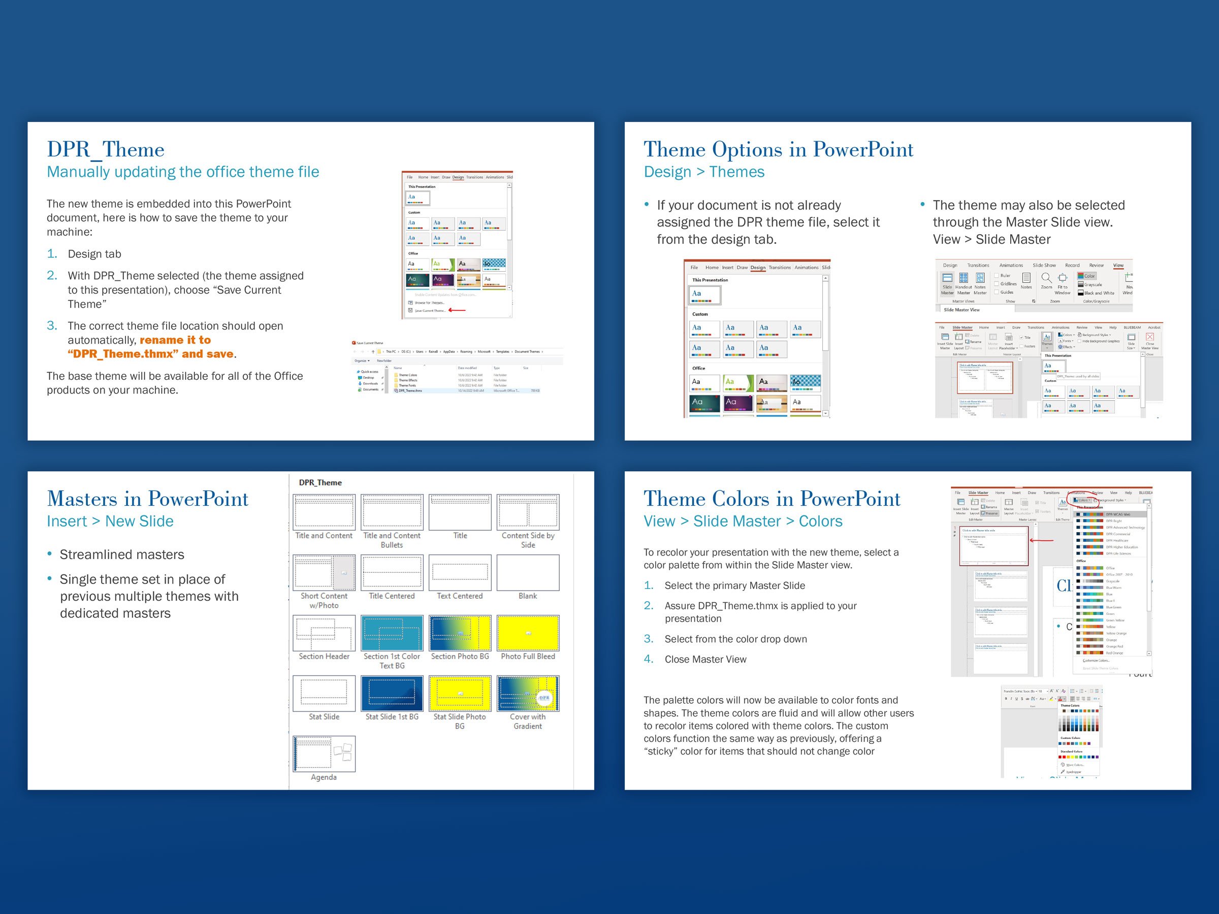
Presentation deck accompanying the rollout of a custom Office theme file.
Quick reference for WCAG 2.1 AA compliant web colors.

Quarterly market conditions reports.
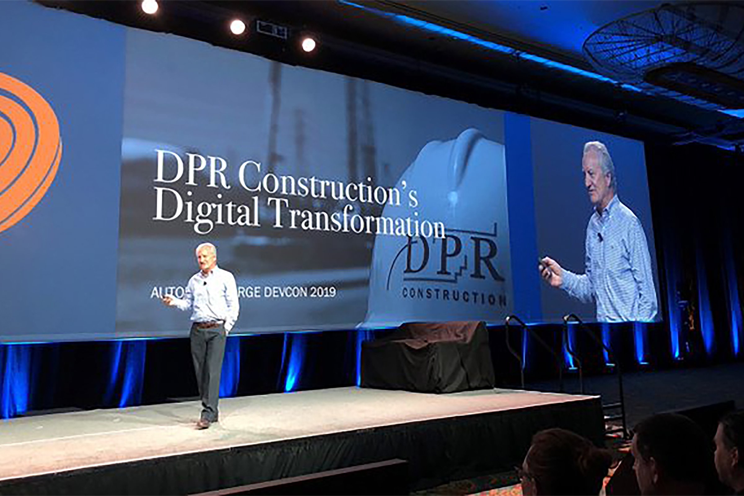
Industry event presentations.
GALLERY